Data Visualization Designer - Predictive Data Science Platform
Overview
Role
User Researcher, Data Viz. Designer
Collaborators
Developers & PM while designing the product. Data Scientists & Back-End Engineers for domain understanding
In summer 2017, I interned as a UX Designer at Trove Predictive Data Science, Buffalo, NY. I helped the team to design the data visualization dashboards that predicted the customer trends based on the current and past trends . The primary purpose of these dashboards was to enable the decision-makers take data-driven decision.
Non-Disclaimer Agreement
To protect sensitive data, I have either changed, fictionalize, or blurred the data.
Context
Prior to my arrival, the internal and external facing products were functionally active. The external facing tools were user centered make them salable and to keep up in the market.
However, the internal facing tools were NOT user-centered.
Why? What about the “customers” who use internal tools? They are none other than the data scientists and the IT admins at the company who will use such tools to analyze and then take appropriate actions.
Challenge & Goals
Challenge: Apparently, the user delight was not taken into consideration when the internal tools were designed. It greatly costed productivity.
Goals: After setting the tone for the internship, my manager and I together came up with these three high-level goals:
Making the analysis more time-efficient.
Revamp existing data viz. charts.
Unified design Language that would enable the centralization of the dashboards
Lesson Learned
I should have gathered data that would provide me insights to outline the business goals as well.
Products & Their Users
I was mandated to design the landing dashboards for two of their main products:
Data Curation: It will show data viz/ charts representing different datasets.
Data scientists would use these product regularly to decided if and how they want to mine more data
C-Level Execs. would use it while defining company strategies.
Data Source: It will show strength b/w server and database. A stronger connection will provide the latest data for Data Viz.
IT Admins would use this product to act upon the weak data sources.
User Research
Analysis & Insights
I used the following framework of Job Story for forming the sense of my research. With the help of this framework I can learn users’ current situation, tasks they would perform, and their purpose.
Success Metric
I introduced Google’s HEART framework to measure the success of the designed. Along with the product managers I designed personalized success metric for both products I designed.
1 . Data Curation
Purpose
Data Curation: Datasets are presented in the form of the most effective data viz. charts that help viewers to glance at the outliers, results, etc.
Primary Users,Insights and Solution
Primary Users:
Data scientists will use this dashboard to find out any anomalies that need their attention and quick action.
Insight 1:
Situation: When they see insights represented in the form of charts.
Motivation: They want to learn right away whether the gathered datasets are made up of sufficient data, if not…
Expectation: They would double down their efforts in mining those missing data.
Before:
Until now, users couldn’t figure out easily whether the amount of data meet the minimum bar for the visualization to be credible.
There is no visual difference between the cards where the data for the Japanese Cars and American Cars. In the given example below the dataset for the American cars is actually missing. Can you tell?
As you could see in the interaction flow below, user would have two go into data fields to check to check completeness of the data.
Solution:
Why should I waste users time by making them look at the datasets which have missing data fields. Instead, I should convey the unpleasant truth right away that data is not sufficient. Like in the solution below, if the dataset doesn’t meet the bar of completeness, then they will get to learn about it through the meter chart.
Insight 2:
Situation: When I am inspecting the condition of German Cars in the stock.
Motivation: I want to understand the status of their condition by just looking at the graph rather than waiting for reading the data.
Expectation: So that I can report it to our sales department to talk to the dealers.
Before:
As you can see below, data regarding the “Ok” and “Defective” cars. Due to the mono-color it is a bit time-consuming for the users to find out the outliers.
Solution:
Now it’s very much visible to compare the cars in the “Ok” condition and “Defective” condition. I made the difference apparent by showing the data above and below the baseline 0 and that too with different colors.
Secondary Users, Insights, and Solution
Secondary Users:
1. C-Level execs will use this dashboard to define long and short term strategy
Insight 1:
Situation: When I am looking at the analytics.
Motivation: I don’t care about the (precise) numbers. That’s the job of data scientists. Not mine. I just want to see the trends, what’s going up, what’s going down over the time.
Expectation: That gives me enough information to decide my business strategy
Solution
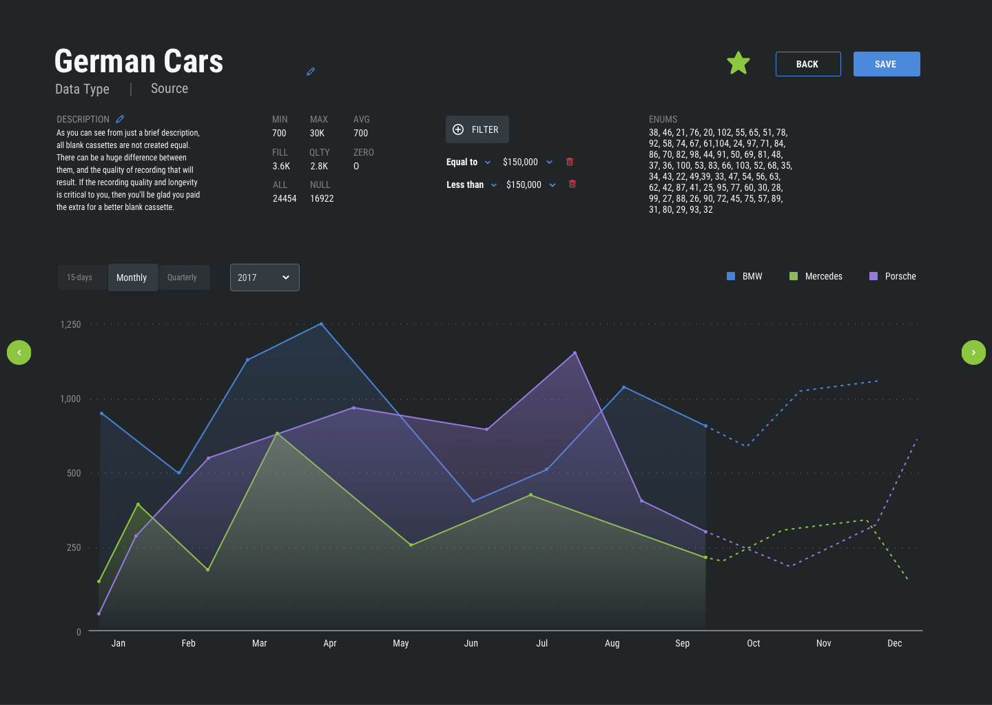
The best way to illustrate analytics is through line chart. Because analytics represents time-series data points. IT shows the data points which change over the time. It should be perfect for past events and predicted trends.
Normal State:
1) Solid lines show the how did each of the german car did in the year of 2017 until on September 10th.
2) Dotted lines predict the sell of those cars until the end of the calendar year
Hovered State:
If the CEO hovers on the the data points for the Porsche car, then all other data points of other cars will go out of focus. Hence, allowing them to focus on one attribute.
Insight 2:
Situation: When CEO is in the Board of Dir Meeting.
Motivation: They would like to have to all the dashboards centralized.
Purpose: For the faster navigation.
Solution:
1) Primary Navigation
Expanded Navigation
Collapsed Navigation
2) Visual Hierarchy
To make it easy for the decision makers to skim the interfaces it should follow the hierarchy or left to right and top to bottom.
3) Filtering the data
One of the most important functions of a good dashboard is to let users quickly chose the datasets they want to (and don’t want to) see.
For the sake of visibility, I wanted to see whether “Filter” on Left or Top makes more sense. But at last, during the usability testing, I learned that users are used to see the filter on the top and due to the lack of horizontal space, it’s better to keep filter on the top.
Version 1: “Filter” on Left
Version 2: “Filter” on Top
4) Carousel vs Grid: Below are the versions to represent the datasets not he dashboard. As shown in version 1, users would scroll horizontally to go through different datasets. And then click on one card to expand it.
During the testing different version with the users, I learned carousels hurt the user experience as it requires users to scroll frequently to see new charts. Whereas a grid of charts let them glance more datasets at a time.
Version 1: Carousel
Version 2: Grid of Cards
Also, scrolling vertically is more intuitive than horizontally.
Final Dashboard: Data Curation
Data Curation: Overview
Data Curation: Detailed
Success Metric
Along with my manager I tweaked the Success Metric’s parameters and came up with following personalized matrix to measure the success for the Data Curation. I wanted to check if the current data viz. engages the audience and if it is, how quickly they perceive the data and initiate their tasks.
2. Data Sources
Primary Users,Insights and Solution
Primary User:
1. System Administrators will use this dashboards to take a view at the data source connection; i.e. connection link between database and server.
Operational Dashboard: These dashboards will show the real-time insights and that will suggest users to act upon it.
Insight:
Situation: When data scientists want latest data from the database.
Motivation: I want to make sure whether the connect between server and database is good enough
Expectation: So that, charts and graphs are represented in the best way possible.
Graph v/s Tables
Solution:
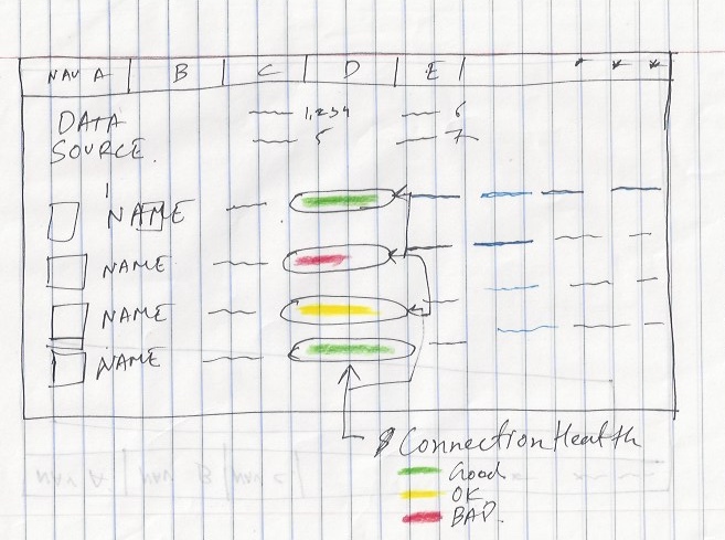
From the users, I learned that they are looking at the dashboards from less of the analysis perspective and more of an operation perspective. Unlike an analytical dashboards, an operational dashboard requires precise information to be included for the users to read.
In my view, to provide users with precise information, there is not better than our same ole’ tabular data viz. Tables could be a great way to present short and specific information to the users.
Version 1: The first version of the “Data Source” health dashboard was pretty self-explanatory to the users. Along with other information, it shows % of the data source connection health.
Version 2: After talking to the users, I mostly got a positive reviews. But I wanted to replace status bar instead of exact % of health for two reasons.
1) I wanted the most important data to be stood out by non-textual visualization. On this page, the status of the connection is the most important data to look at.
2) When I spoke with users, I also learned that they are not concerned about exact % of the health. As long as the status bar conveys them whether the connection is healthy and unhealthy.
Final Dashboard: Data Curation
Success Metric
Being an operational dashboard, it should serve purpose of its name. Task Efficiency is when users quickly spot the anomalies and able to take the actions.
I also added “Happiness” parameter. Because happiness can affect one’s efficiency and engagement. If one is happy they will be productive in their work.
Conclusion
It was fulfilling and learning internship experience. I got to worked on my visual design skills along with the deep product thinking. I couldn’t ask any more supportive team. I learned so much from their guidance and critical feedbacks.
Design System Case Study
Just a reminder that if you would like to view the design system I built as a part of intern project, please refer to the link and password below.
Link: https://dishant-ux.com/intern-design-system
Password: design11system
What I Learned From My Teammates
Landing to the first role of designing B2B products I felt there are far more stakeholders involved in the development process than I expected. Reason? Reason is each product cycle should nearly 100% adhere to domain and technical constraints. Otherwise, entire system fails, business breaks! And we CANNOT afford that.
More people involved in the process would communicate all the possible constraints of the tangible and intangible system. Hence I took a lot feedbacks of my work from each stakeholder involved. For the time being, it help me craft the product better. But in a long run, it helped grow as a whole designer.
Two biggest (intangible) design skills which I learned are:
Collaboration: Beautiful craft consists of lots discussion, different perspectives, research data to back, paper sketch, whiteboard iterations
Story Telling: Bruhhhhh! why to waste others time by telling them the non--cohesive, long stories. I learned to identify my audience and then to present the information which they need the most. And through the compelling delivery, help them understand about the users’ problem and its potential solution. Leave the rest to the “QnA” session.
I truly feel blessed to be able to collaborate such stakeholders: product manager, front-end engineers, data scientists, database engineers, system administrators, upper level management, legal managers, and the content strategists.


