
Sponsored Project: Designing A News App for Younger Generation

Project
As a part of a sponsored project in 2024-25, I helped University of Cumberlands redesign USAToday mobile app.
Why USA Today?
USA TODAY reaches an older demographic and sports fans, but misses out on an opportunity to expose a younger audience to relevant news. This audience is accustomed to a slanted tone, are skeptical of news, and are surrounded by an extensive amount of sources.
Interactive Prototype: It is embedded beside this section. If due to some glitch, it doesn’t work then I apologize, and I am publishing static mobile screens right below
Final Hi-fi Solution


End-to-End Case Study
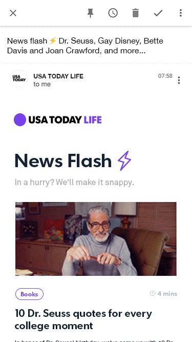
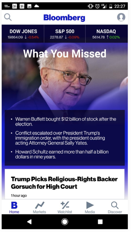
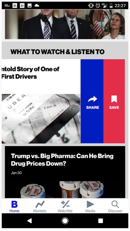
Existing App
The existing USA Today App is responsive but not designed primary keeping in young generation in mind. As you can see in the example below that its interfaces looks like a squished website which reminds you of their website, but it doesn’t seem like a mobile-first application.


User Insights
Since I had a leisure of conducting user research, I conducted interviews and surveys with around 60 young adults. My target participatns were between 20-35 age. Below is the insight summary that I distilled from the user research data.

User Persona and Journey
From the user insights, I created three key personas that will help us to further our designs.


App Goals
After learning about the users in greater detail, I laid out the App Goals that had worked as a north star for us for the rest of project.
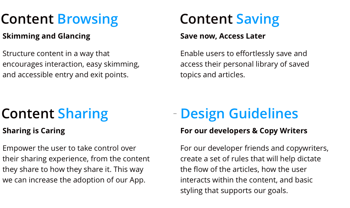
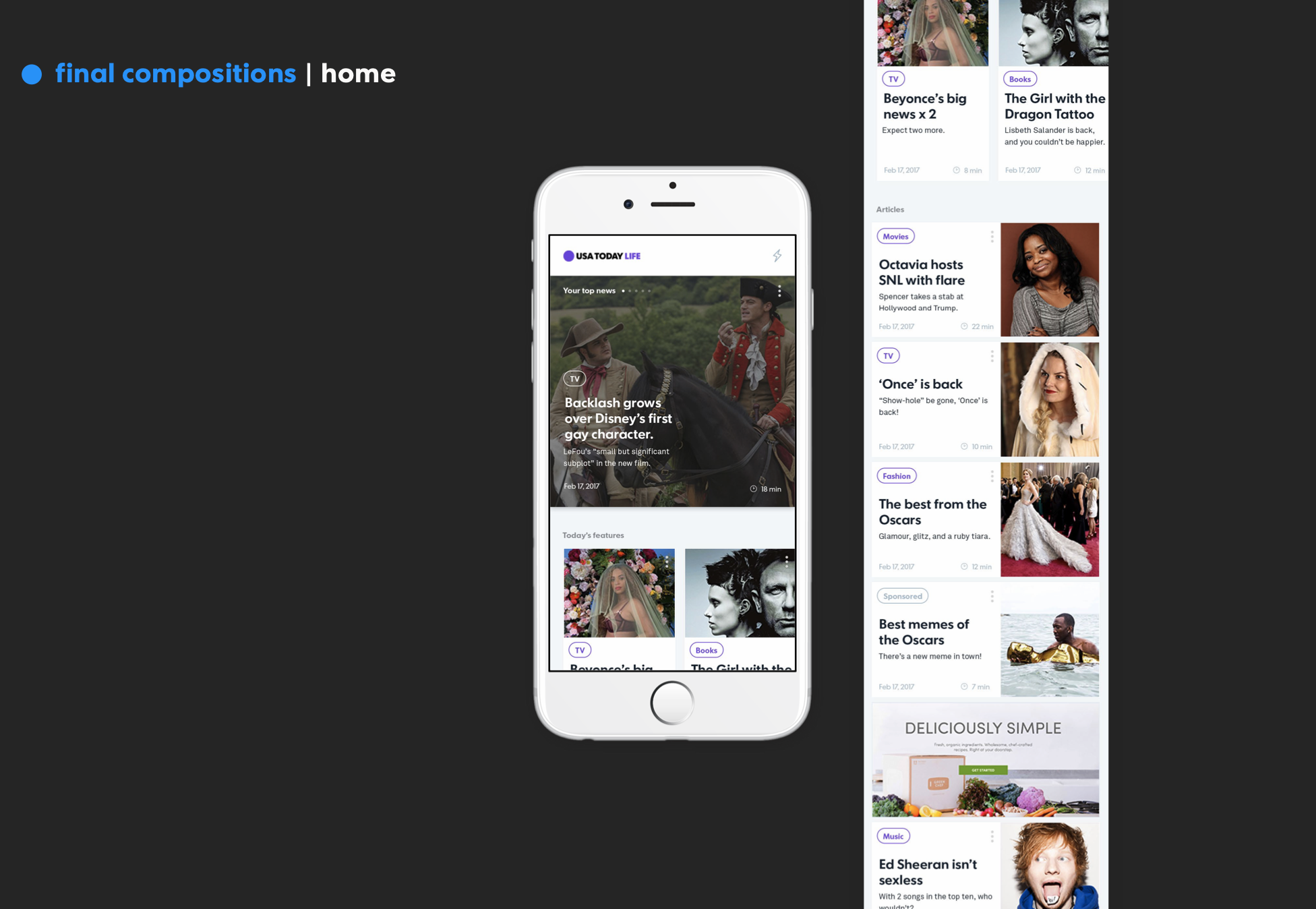
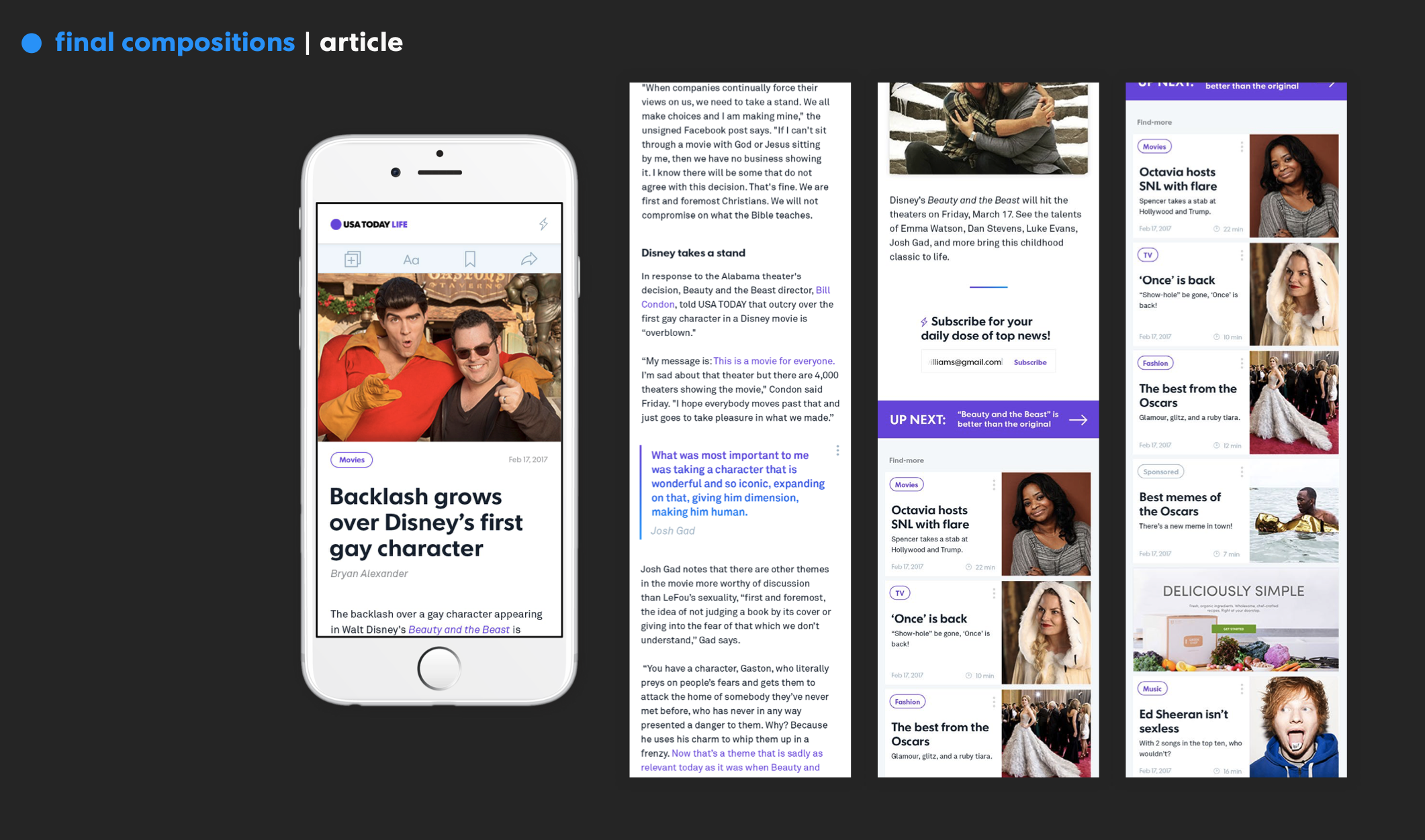
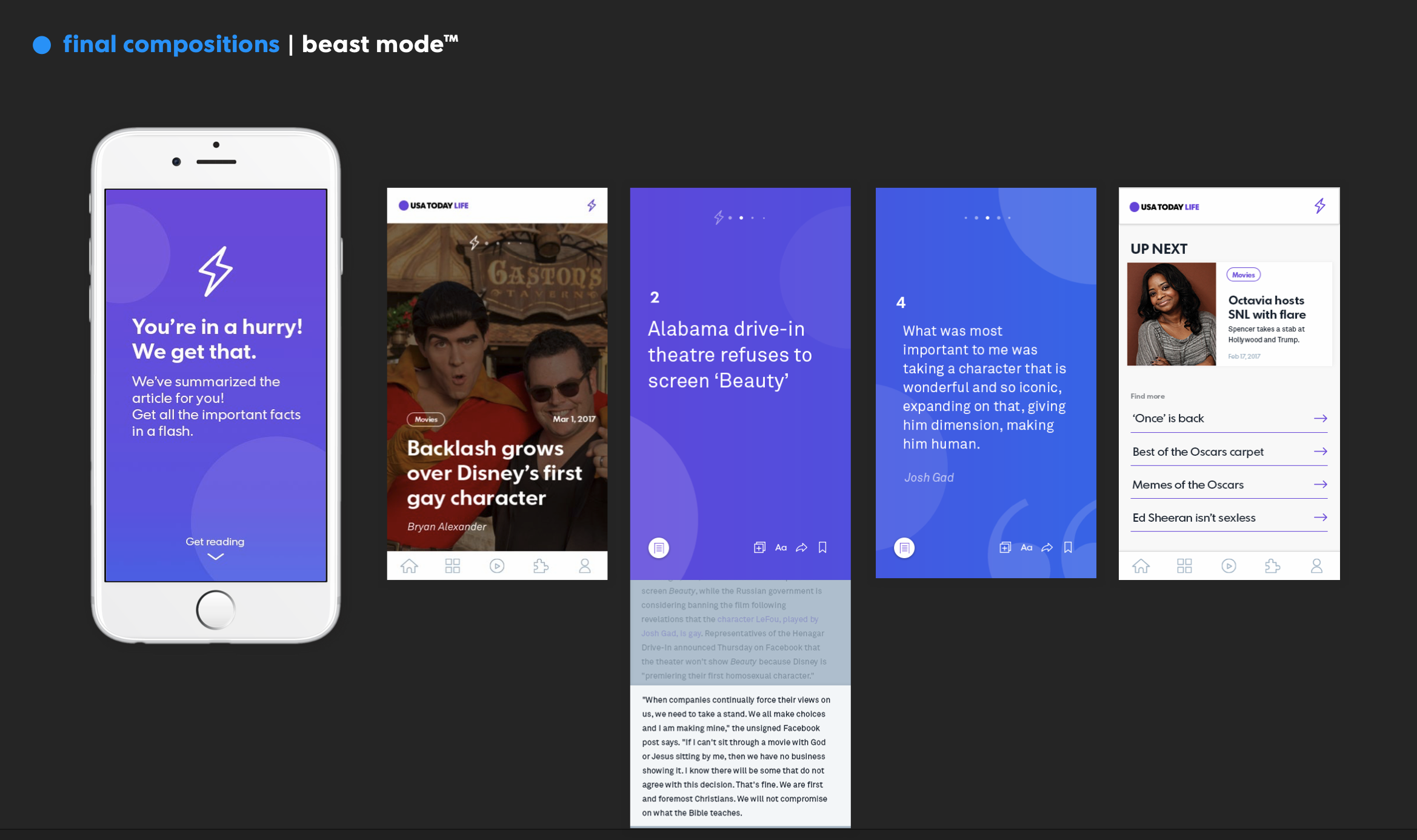
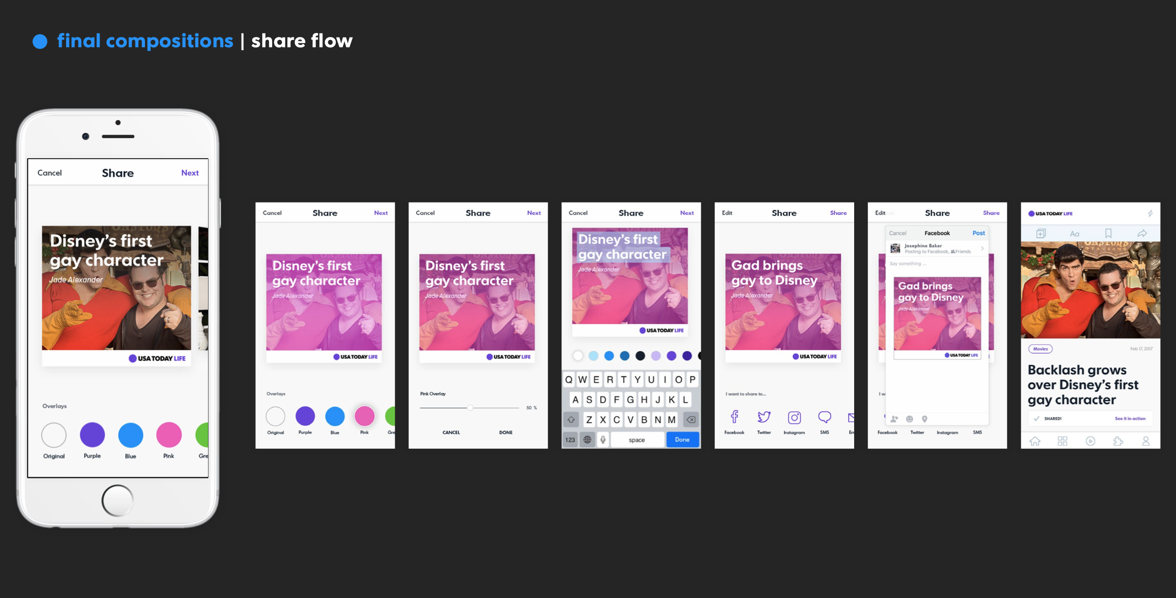
Key Features of the Redesigned App
Now, before I showcase the process of sketching, iteration, and feedback, lemme quickly show you the key features of the app. Then we’ll get through the design process much detail.
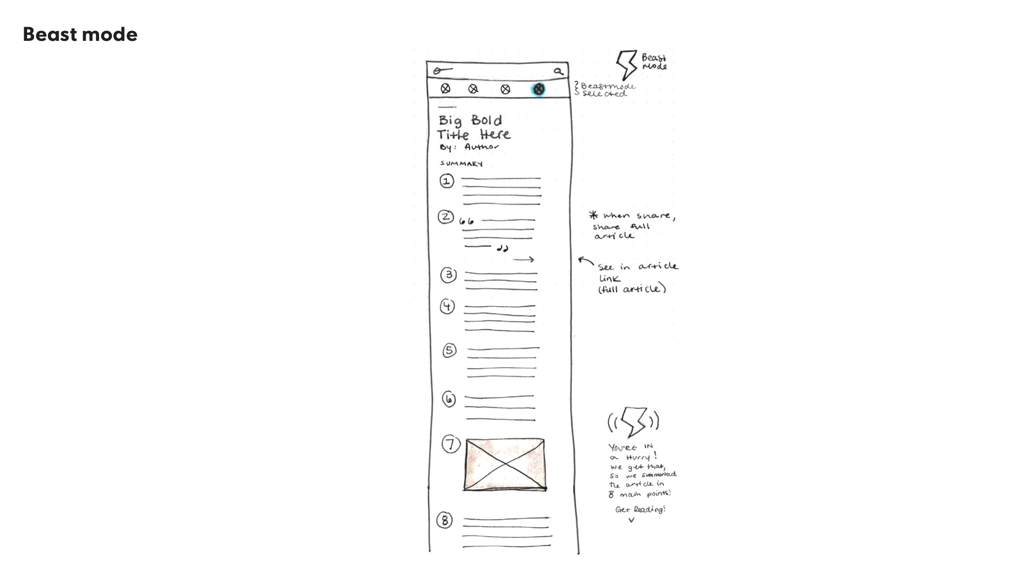
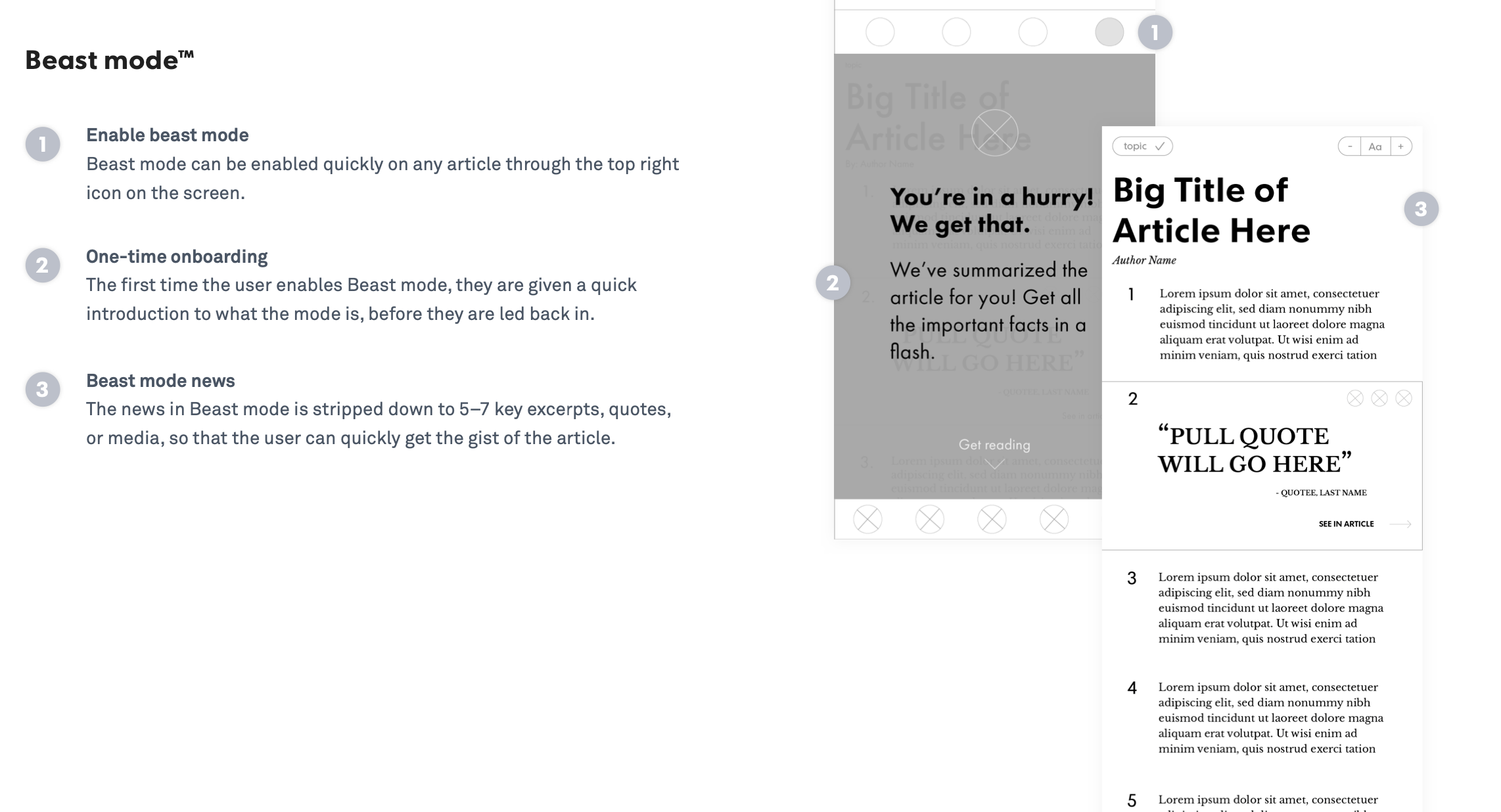
1) Quick, On-The-Go Mode: Satisfying the goal to easily browse content, we make it as easy as swiping through key excerpts and pull quotes to get the full gist of the article, without having to spend more time than you have.


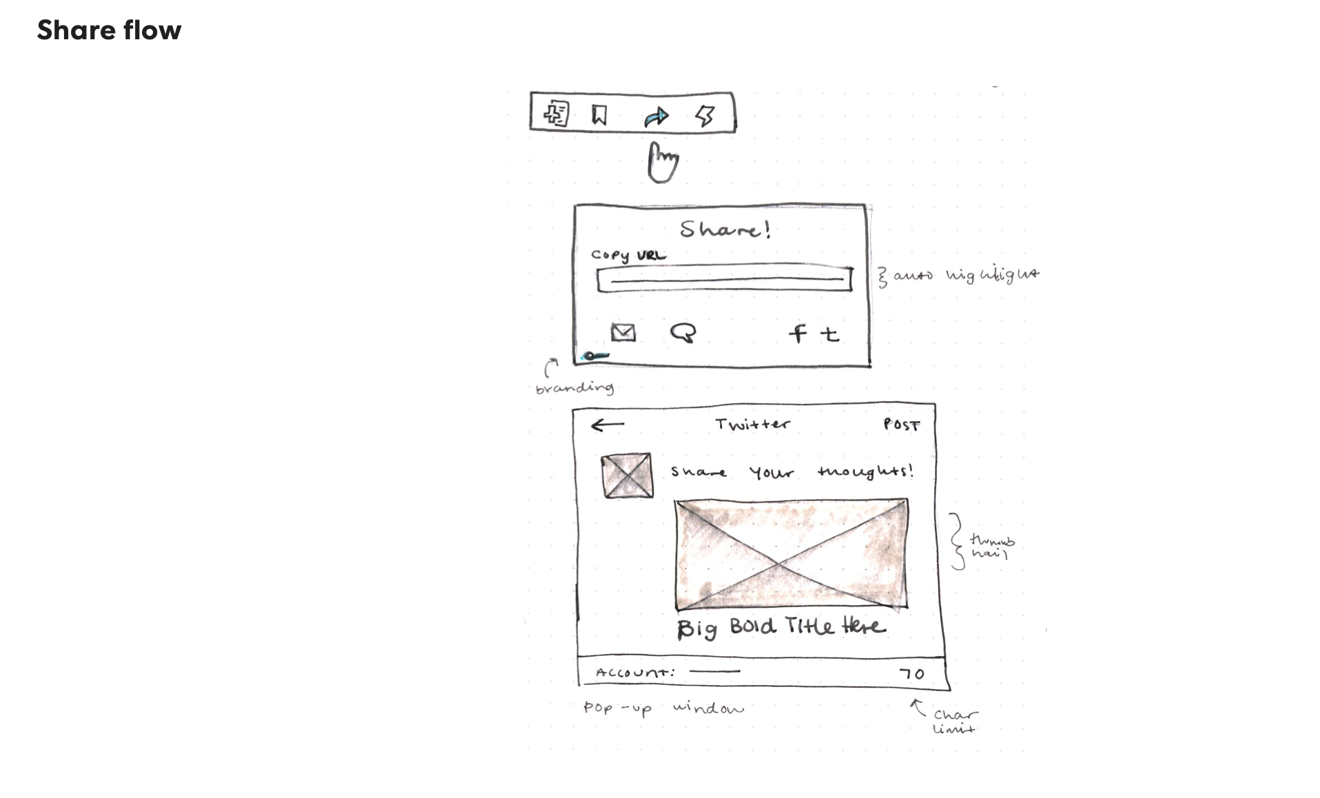
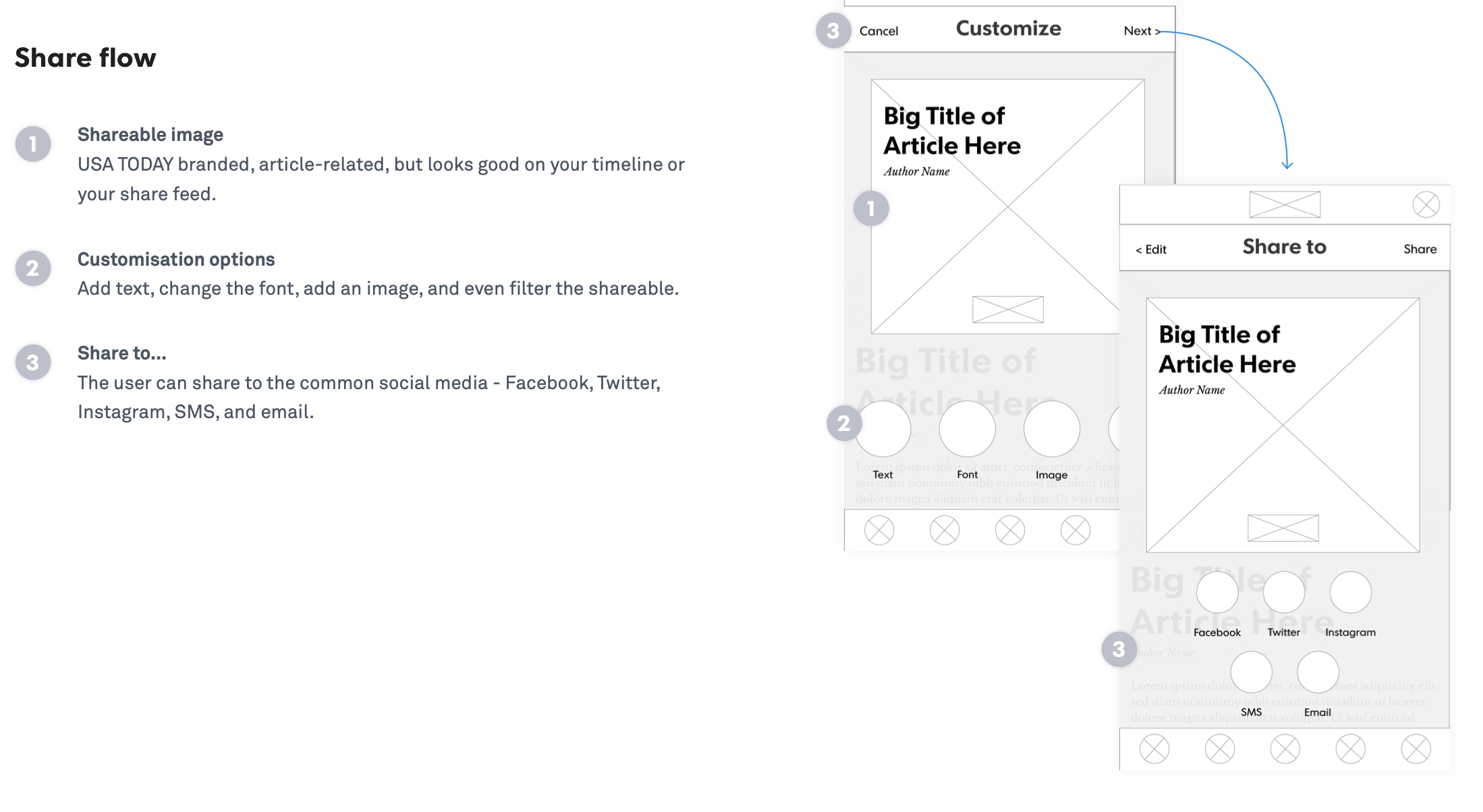
2) Customize Sharing: This feature gives you control over the content that lives in your social media. Because this generation likes to take ownership over the things they share to social media, want to empower you to add your personal touch to the content that lives on your profile.


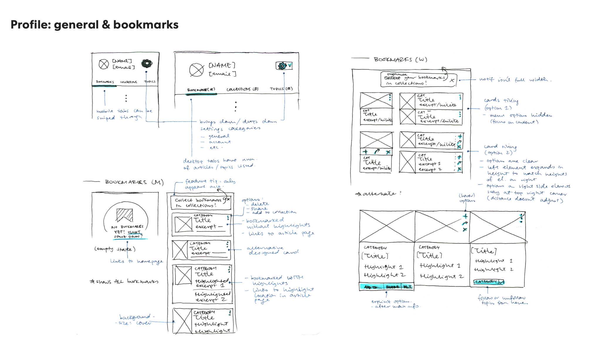
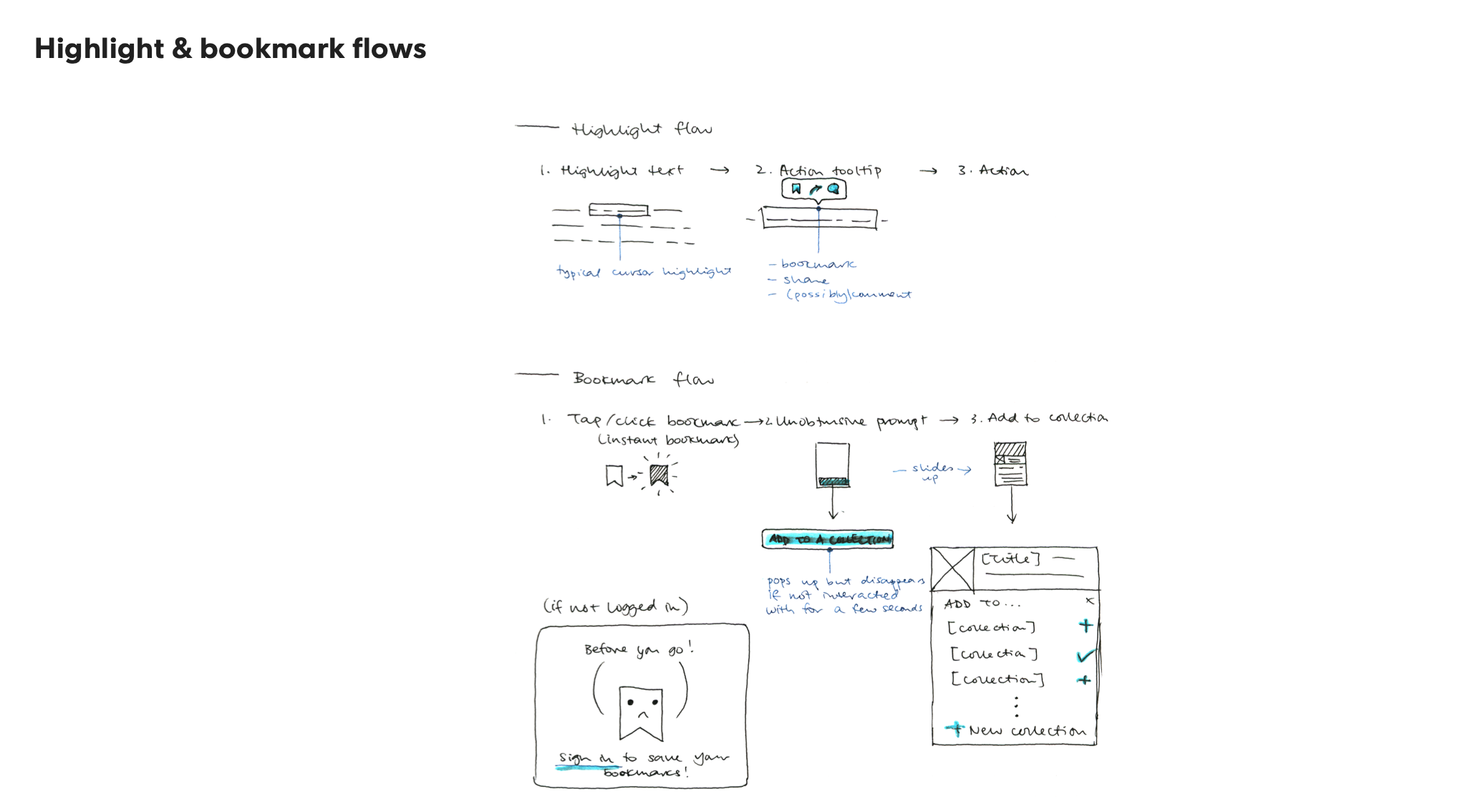
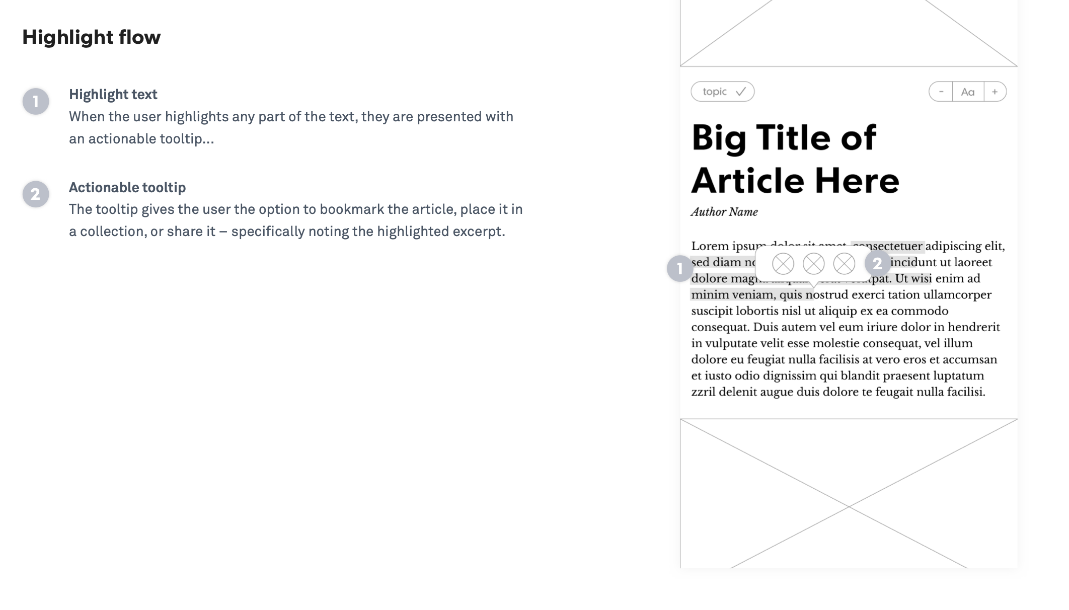
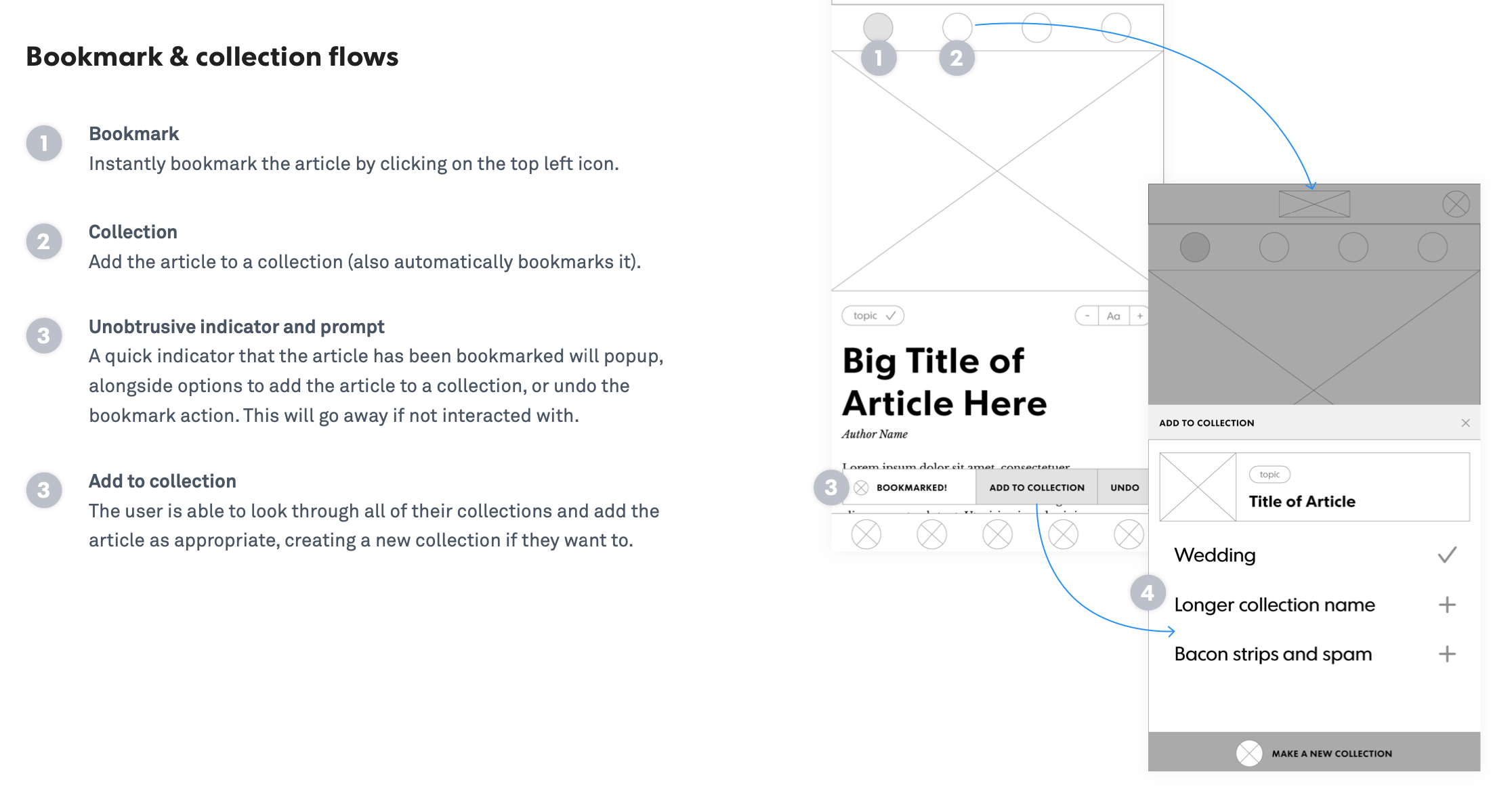
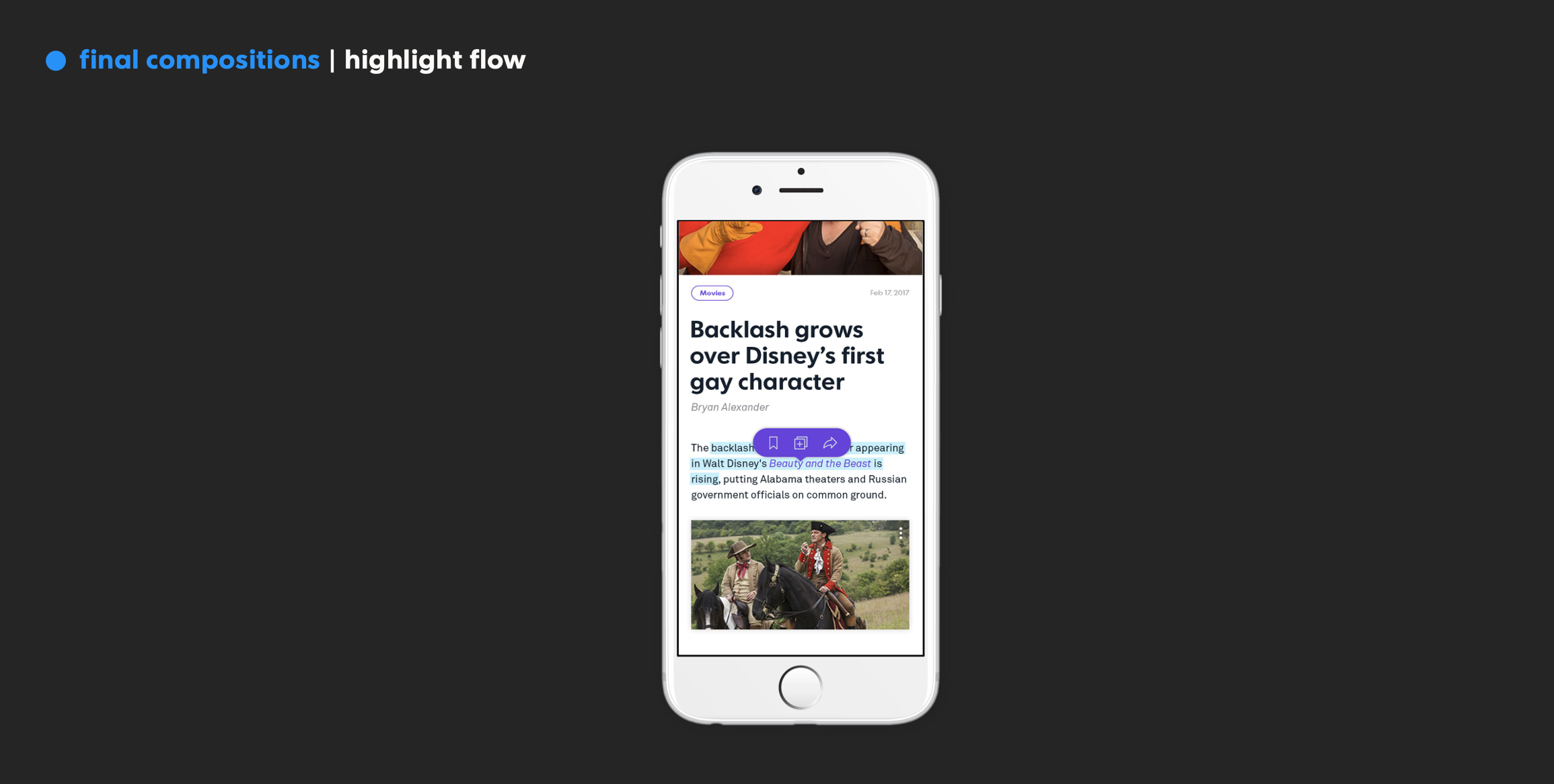
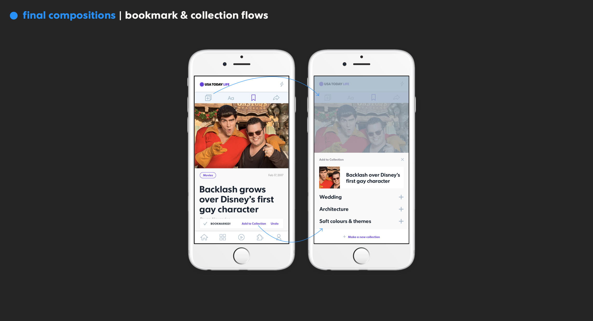
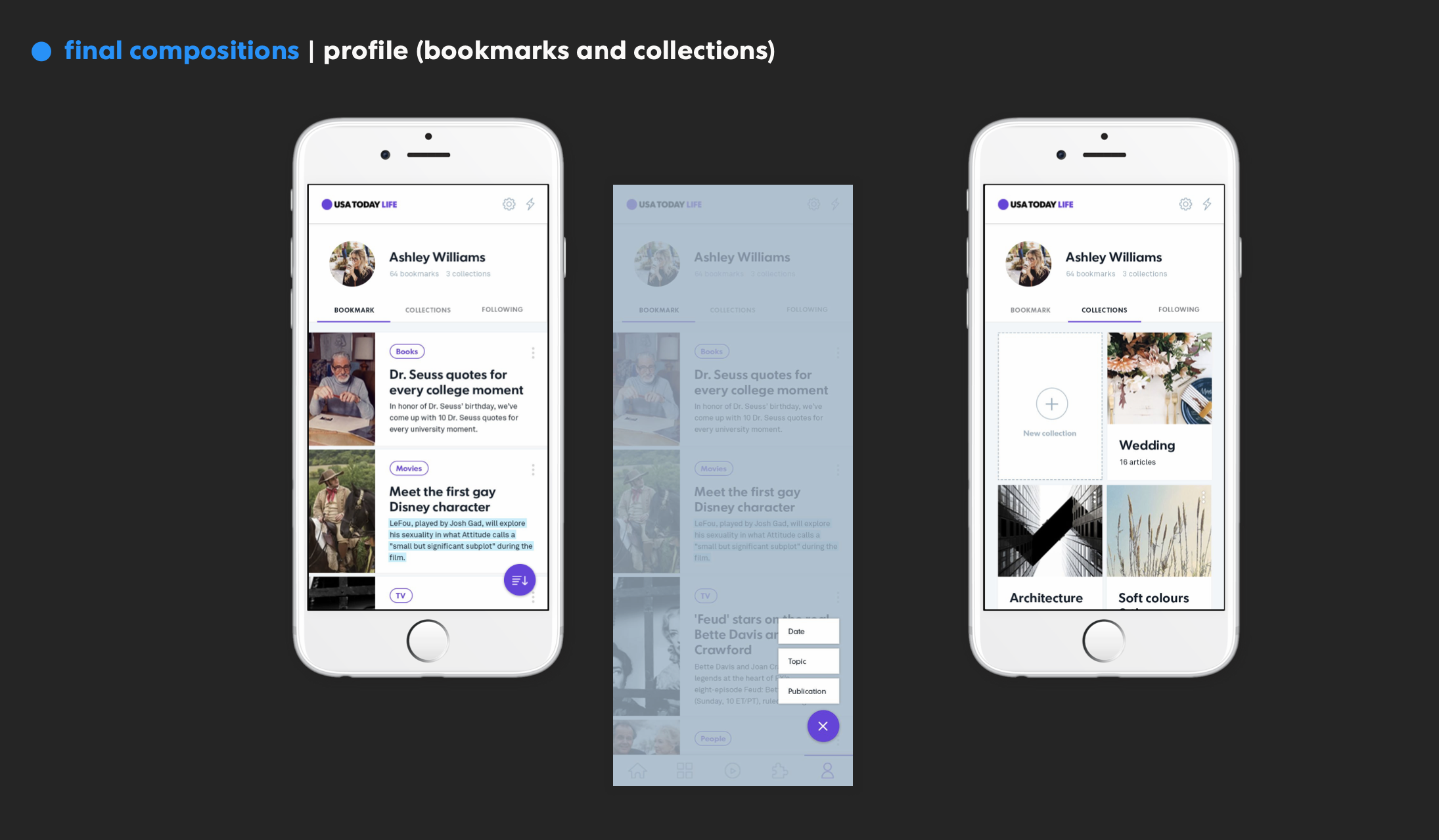
3) Highlighting and Saving the Text: Understanding the value of saving and sharing quotable sections, we want to give the ability to cherry-pick snippets that stand out to you.
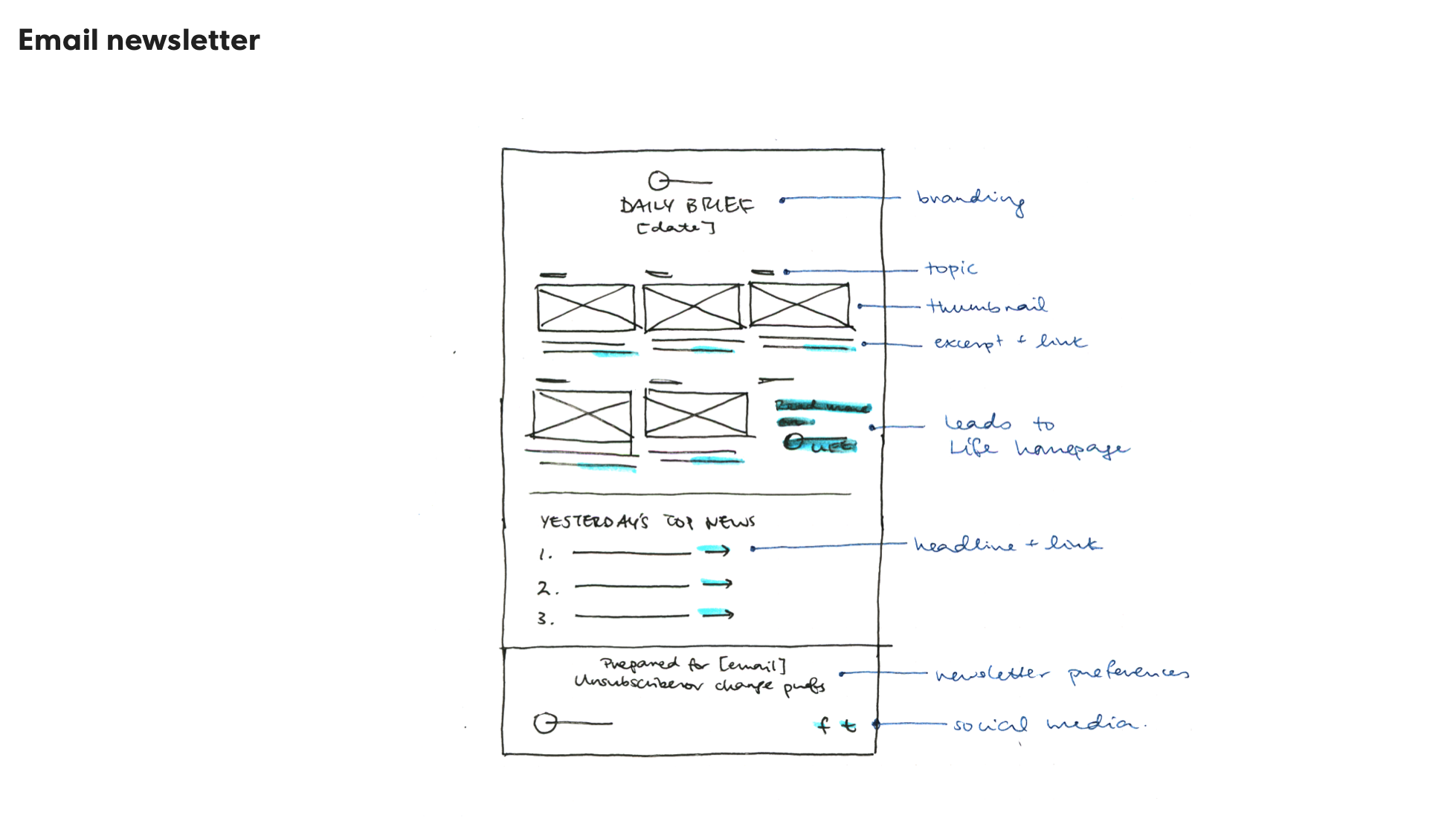
4) Email Personalized News Letter: Newsletters provide a reliable way to receive content, but we want to make this one personalized for you.
Design Process
As a part of process, I conducted competitive analysis of contemporary apps, designed and refined sketches, created information architecture, and workflow of the product. In the end, I created the UI designs, interactive workflow, and prototype as a part of the deliverable.
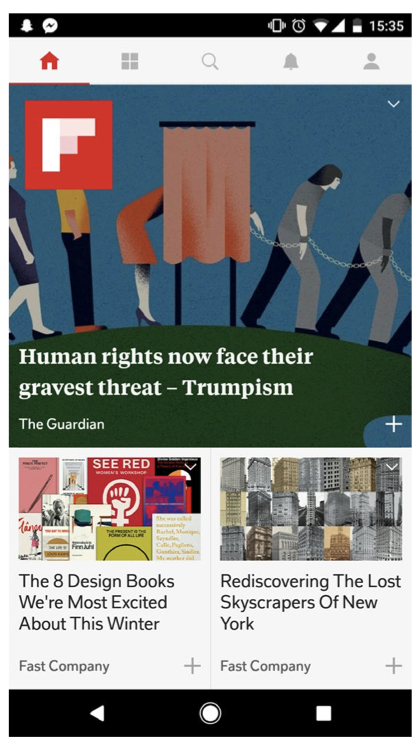
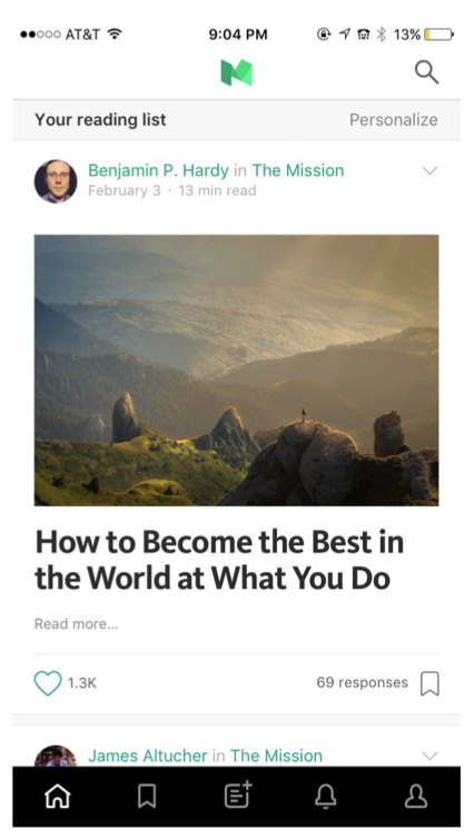
Competitive Analysis
After laying the App Goals, I got the narrowed down how I will analyze the contemporary content-heavy apps. Of all the apps I analyzed, shown below, I learned that all of them were primarily designed for the experience and usability for the mobile users.
Sketches
After comprehensive research and analysis, there is nothing that had guaranteed me a well-designed app than designing lo-fidelity, sketches, and getting feedback from the test participants. Though this process I learned that the best way to design a good product is start design ASAP and fail and learn and apply, and repeat.
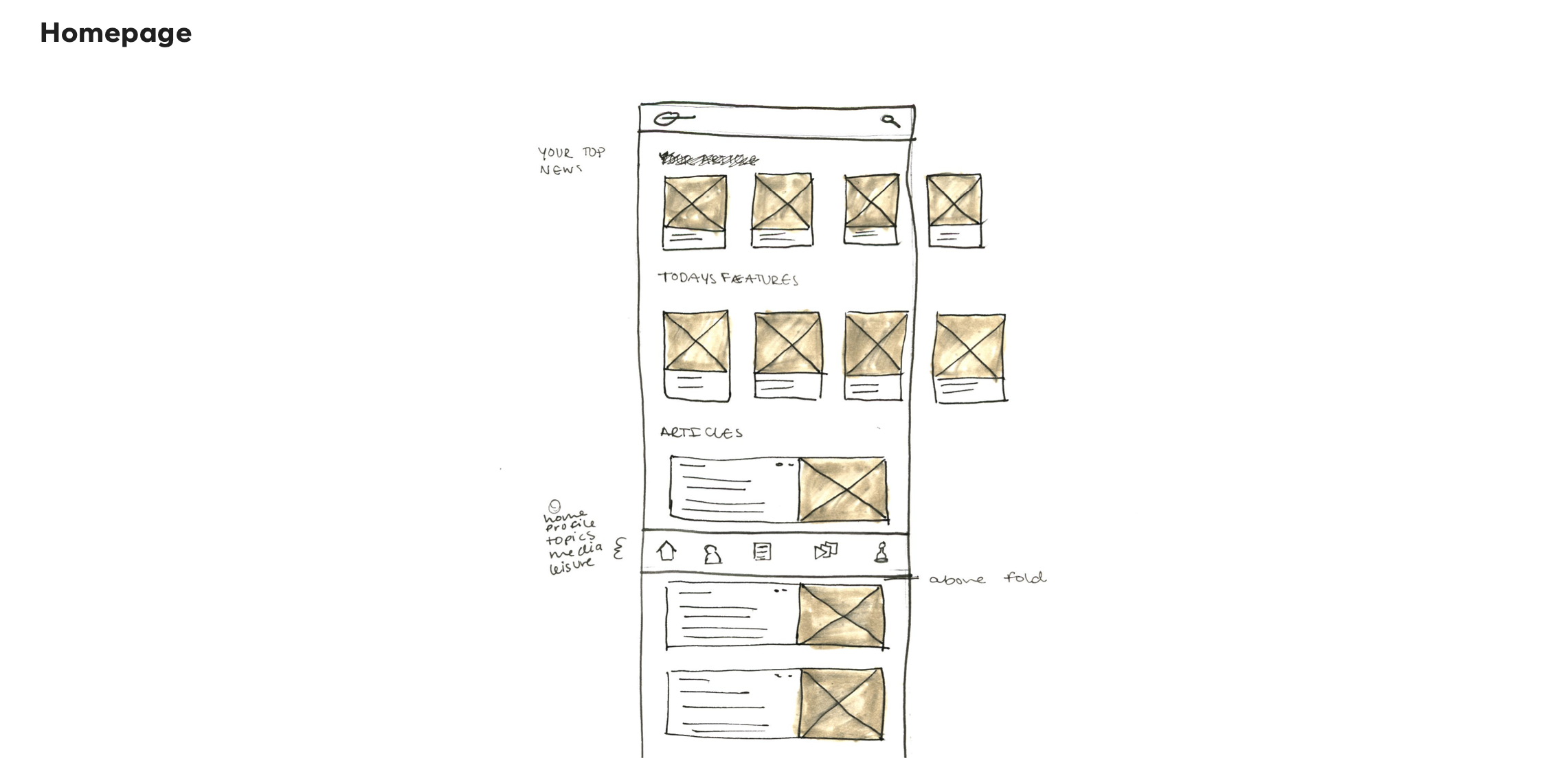
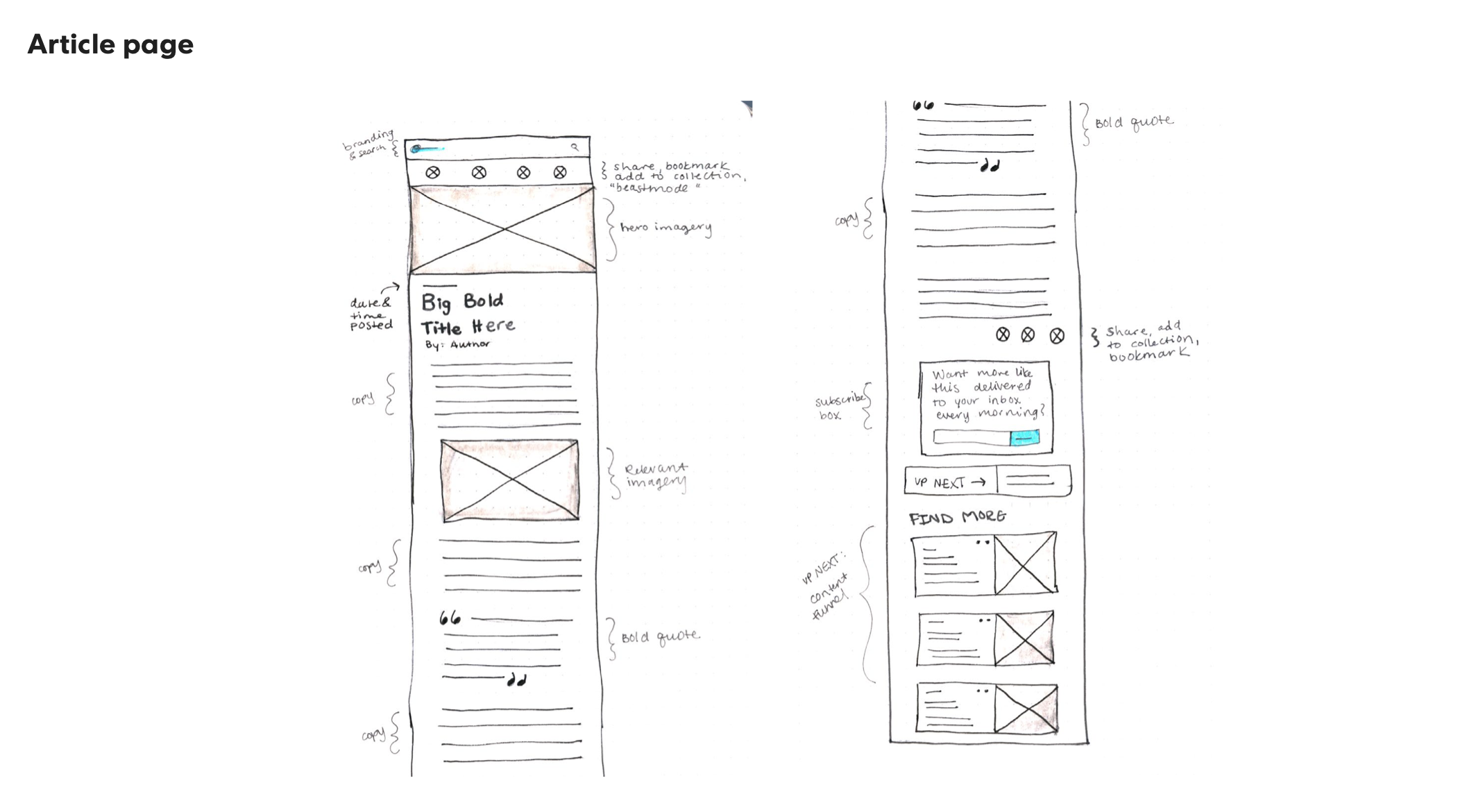
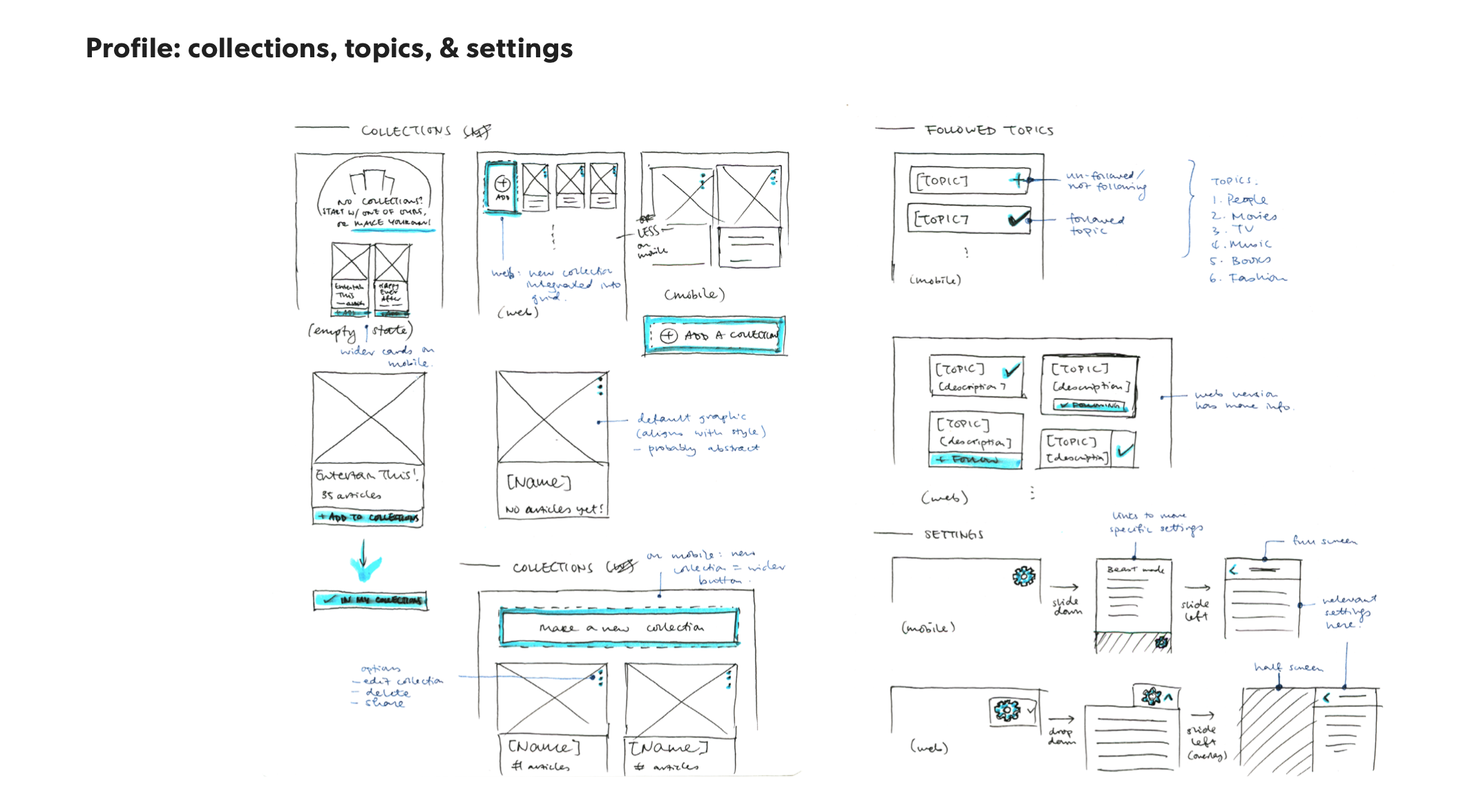
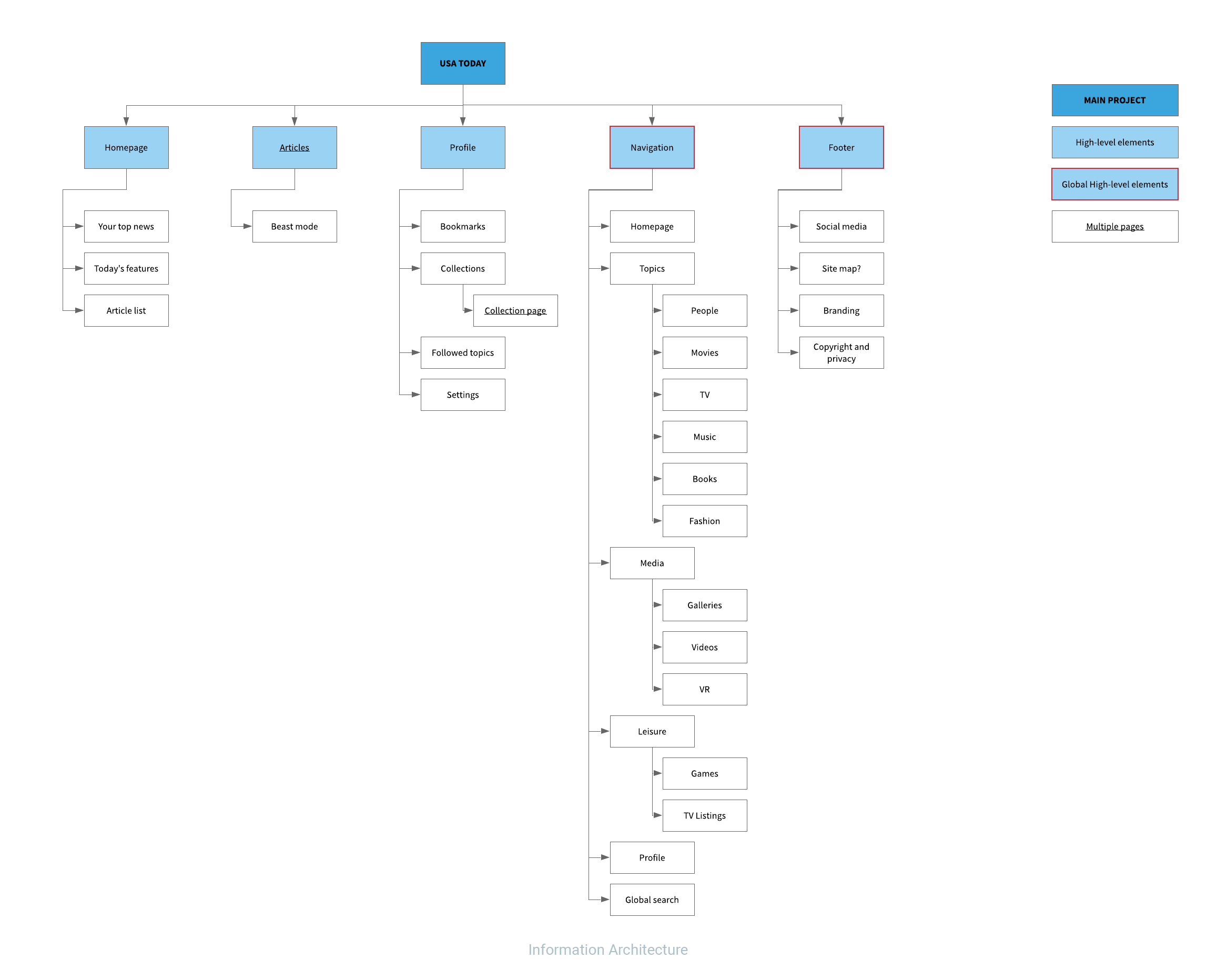
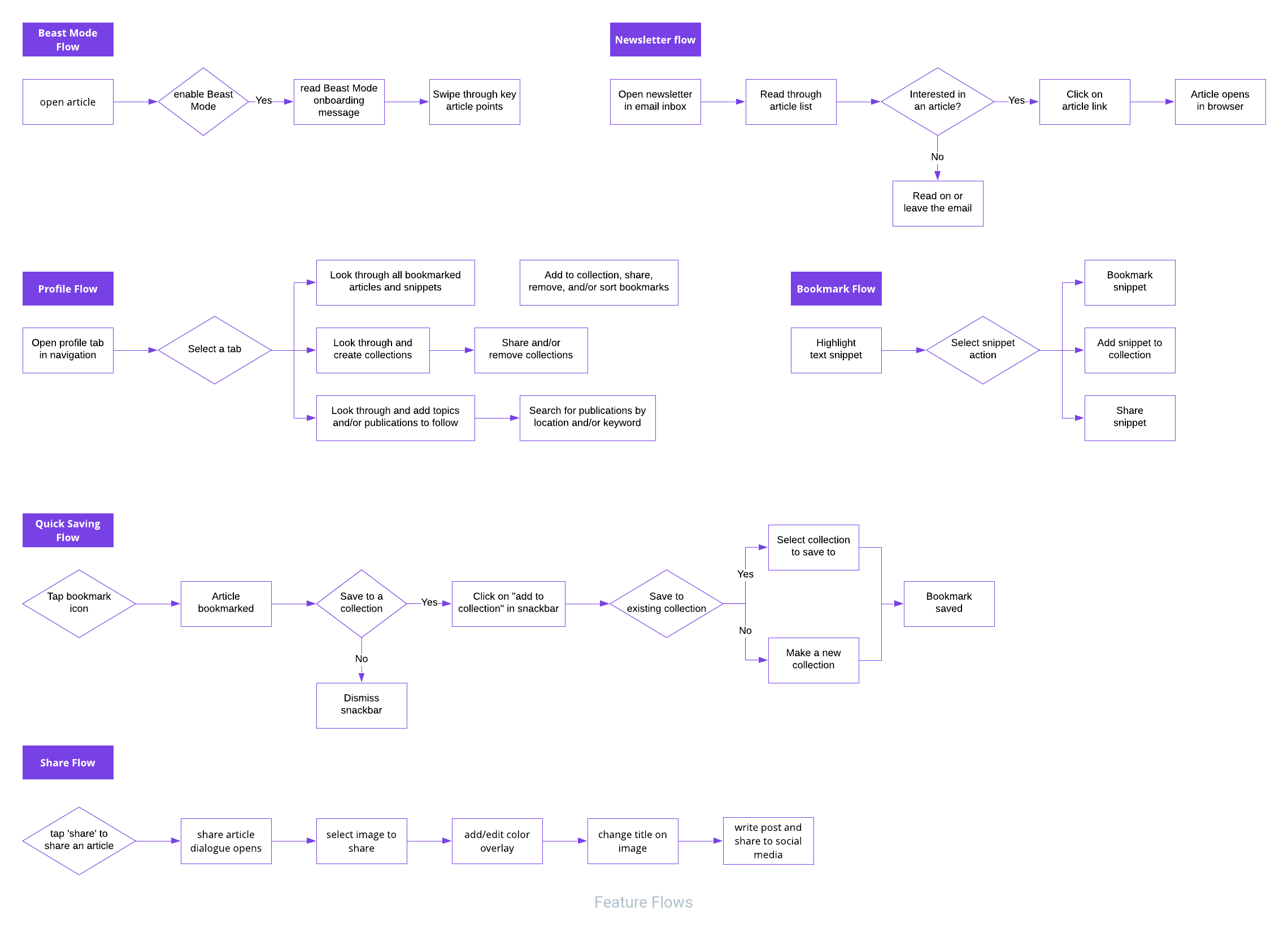
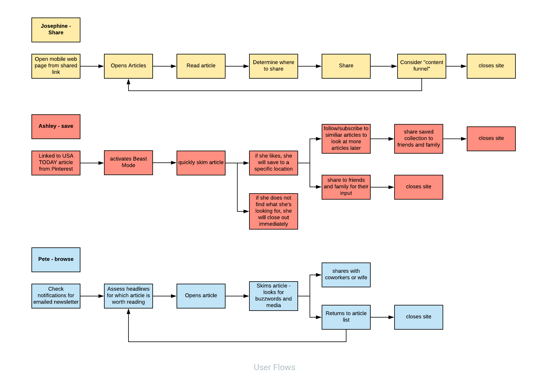
Information Architecture, Feature Map, User Flow
Rapid sketching and refinement helped me to have a clear view of information architecture. Once the content map was laid out, it was time to define the features in detail, and then in the end the user flow have helped me refine the user interactions.
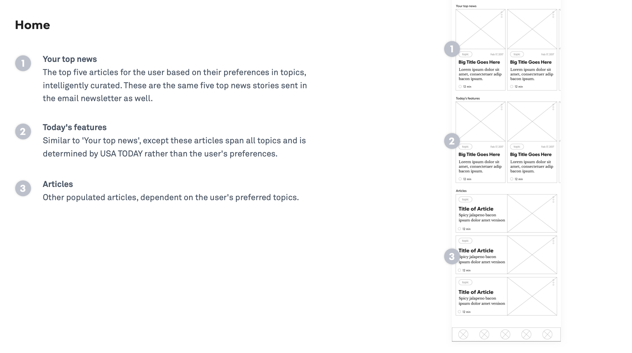
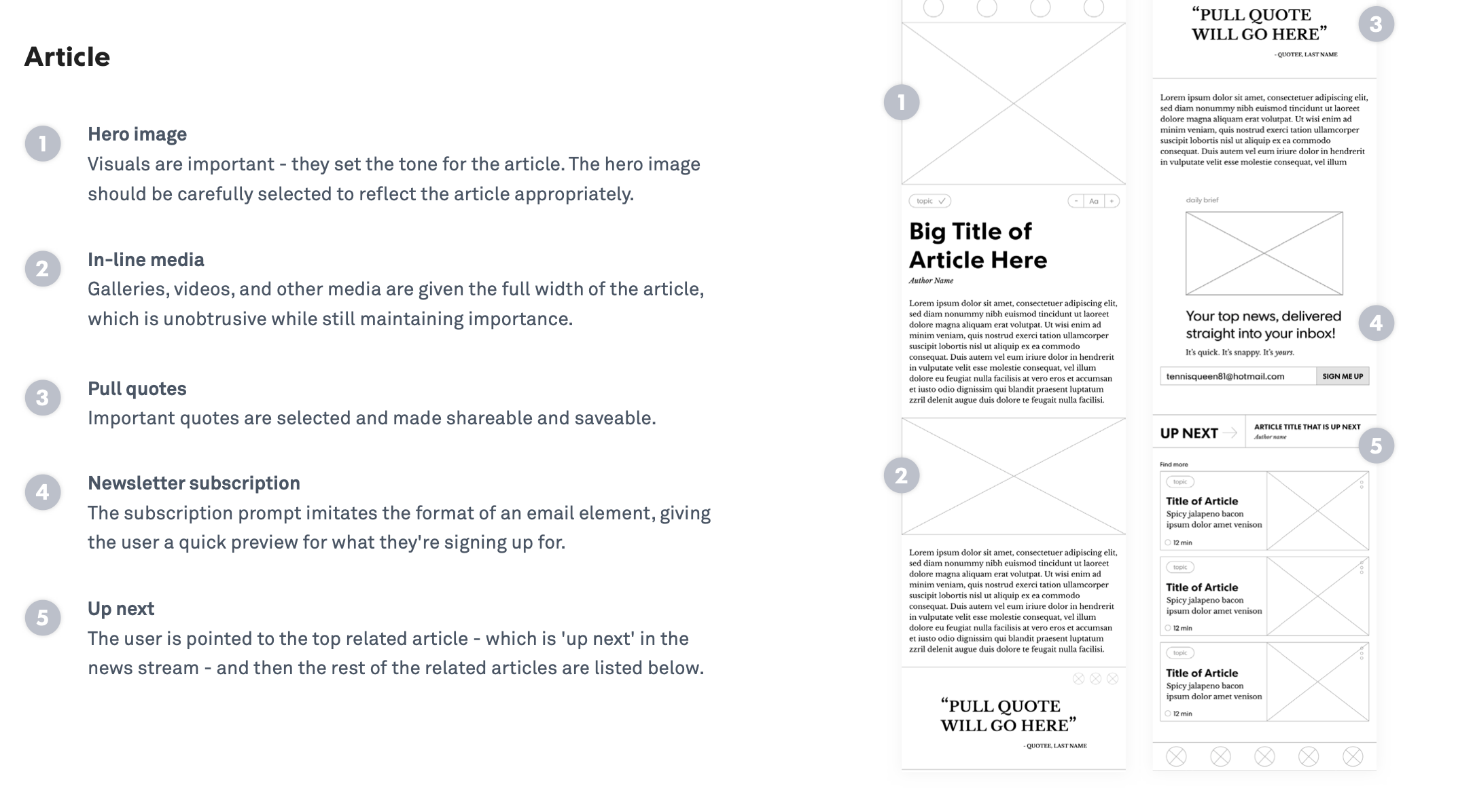
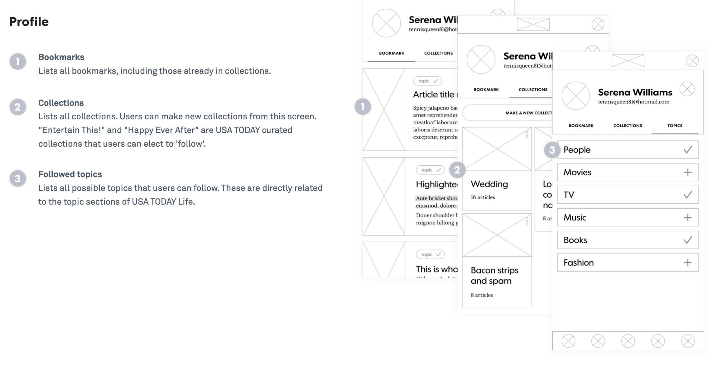
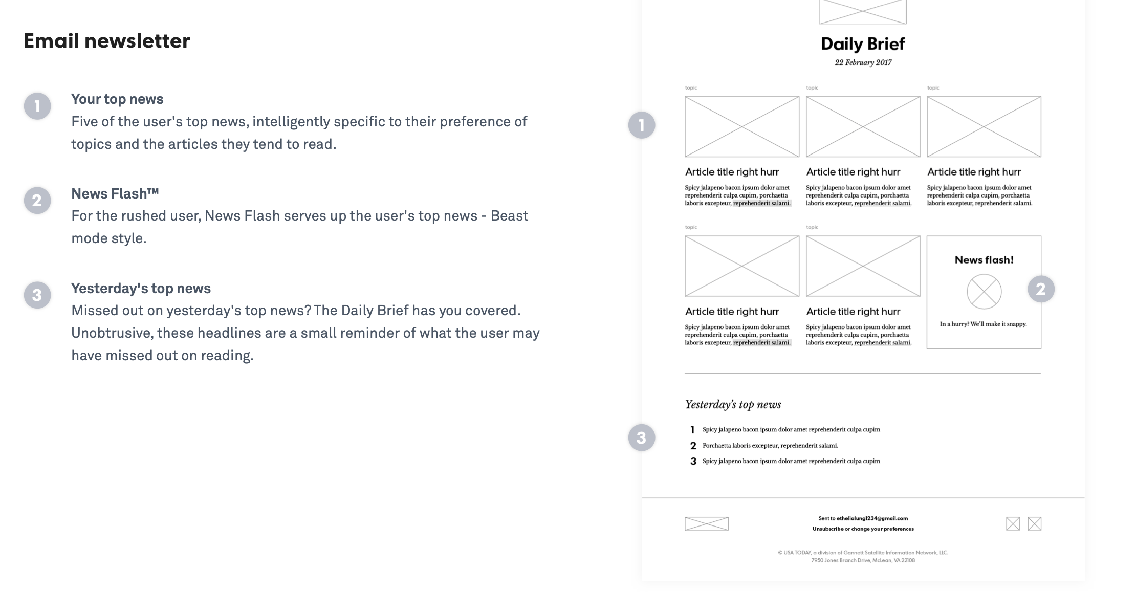
Refined Wireframes
Having Feature Flow and User Flows handy helped me a lot to come up with final set of wireframes without adding visuals.
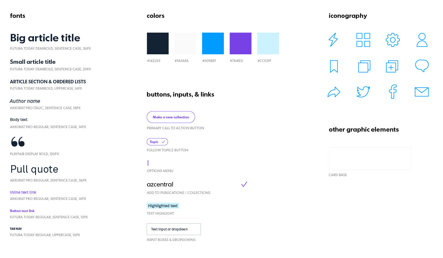
Visual Styleguide
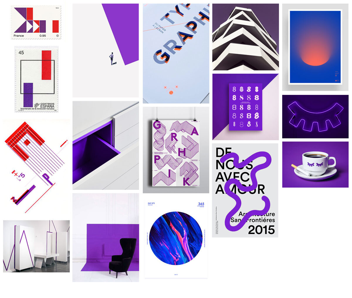
I came up with a guidelines and style guide that reflected the goal of our product. I wanted to create a look and feel that would resonate with a younger generation, and creating a visual direction and style guide ensured that I was aligned and consistent across the product.
High Fidelity Wireframes & Flows
After getting ready the style guide, I started skinning the app. I was mindful of the heuristics and usability during this phase. Whenever I felt stuck, I made sure to test my designs with the users to get their feedback.

Conclusion and Learning
The purpose of this design challenge was to create a full-spectrum delightful experience that would include by executing user research, interaction design, visual design, prototypes, and motion designs. So I am confident that I am have stood corrected on fulfilling my purpose. However, if I have had access to the engineers, I would love to have their inputs for the product I was redesigning. I would be an proactive collaborator and would be open to new ideas that would intersect the attainment of the user needs and technical feasibility.