
Design System & Brand Identity - Trove Predictive Data Analytics

Concept
In summer 2017, I was part of Analytics team Trove Predictive Data Science as a UX Design Intern at Trove, Buffalo, NY. I bet it was one of my preeminent work experience that helped me develop product design thinking, cultural aspects and managerial skills at the enterprise level.
In this document, I am going to show you the design system and the visual identity that I created for the product I am designing. I created the 95% branding from scratch.
My Team
For this project I primarily worked with the CTO and a front-end engineer. I worked with the CTO to get the buy-in on the overall branding and visual identity. And, the front-end engineer gave me the feedbacks on the component library I created; whether they are easily developed.
Understanding Users’ Problem and Challenges

UX Audit - Inconsistent Existent Components
All the users did a good job explaining their story. But the designer in me got the intuition to audit all the products and dashboards. I didn’t observe just the ones which I needed to redesign but also others as well. I wanted to see how the other products in the house are doing visually!
….And I had hunch about that! I had a gut feeling that maybe there is inconsistency at at micro-levels.
As you can see below, there was inconsistency in buttons, shapes, and hues. Primary buttons were skeuomorphic and secondary buttons were flat ones.


Along with that there is lack of feedback in micro-interaction. As you can see below, visuals of text box stay same regardless it pressed onto or hovered over it:

There has also been case where components had been poorly utilized. Like, in the case below, There was a dropdown menu for only two options.

There is also an example where Check Boxes and Radio Button both had been for selecting countries. Both had the same functionality but with different visual components.

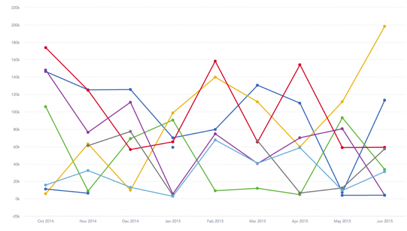
Besides the 3D charts, even clean, 2D line charts didn’t illustrate the data points clearly.
“Design System First” Approach
The traditional product development approach at the company has been in following order: designing wireframes, designing final UI, and then adding any new design pattern to the inventory. Each time the designs were created, the components and elements were designed from scratch. But the importance was given to the Final Result - hi-fi, pixel-perfect user interface.


Exploratory UX Testing
For building the design system, I identified that Product Managers and Front-End Engineers would be the best people to work with since, I would need their validation as they look through the product from the lenses of technical and business standpoint.
I gathered all the front-end engineers and the product managers in one conference room and asked them to what makes them happy and what makes them sad about the interface. Also, they were allowed to write the notes for any suggestion or advice. So it will help me to scope out the most important components.

From the sticky notes analysis, I found one quote which was funny and fully of sass. The satire couldn’t have been represented the frustraion of the developers in a more effective fashion.

With the help of my manager, I was successful in conducting the interviews and reaching to a conclusion that the primary components to focus on in this first version of design system:
Functional Components:
1. Button
2 Text Boxes, Text Field, Text Areas
3 Dropdown Menu
4 Check Boxes, Radio Buttons, Toggle
5 Tool-tips for error messages
Brand Elements:
1 Color
2 Typeface
Ideation
Components Iteration
Besides inconsistency, there were two things were missing from the existing system:
1 No micro-interactivity when while interacting with the components.
2 No documentation at all for the design principles. And what should and should not be done.


There is no use of visual components and their micro-interaction if they can not be developed in the timely manner or at all. I worked with front-end engineers and product managers as I would validate my designs from the business viability and technical feasibility viewpoints.
Sporadically I would take buy-in from the upper management. For documentation, I would also need to work with the Content Managers.
Contributors/Blue Print of the Design System

As illustrated there are total 5 building blocks of the design system.
I would collaborate with the Content strategists write design principle of the components.
I would take care of Visual Components and their Micro-Interactive States.
I would collaborate with the front-end engineers to see if the components are developed in HTML/CSS and React. And, I will make them add code for each corresponding components
Design System Part 1: Functional Components
Functional Component: Form
Collecting information from users is paramount in data-driven applications. In order to collect clean and accurate data, it’s critical to select and use the most appropriate input type.
1) Text Field and Area
Do use it when you are collecting user-specific unique information that can’t be foreseen ahead of time. Like, name, age, email address, etc.
Don’t use it if you can provide the options. For that, use checkboxes, radio button, slider, dropdown instead.


2) Checkbox
Do use it when you provide 4 to 8 mutually independent, choices to choose from. The data we collect should be discreet.
Don’t use it if you have more than 8 choices.

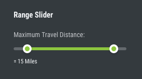
3) Range Slider
Do use it when we want to collect multiple, continuous data from the users. The slider should represent the continuums of space or time.
Don’t use it at all if the data is discreet.
4) Radio Buttons
Do use it when you provide 4 to 8 mutually exclusive, choices to choose from. Only option option is to be chosen.
Don’t use it if you have more than 8 options

5) Toggle Switch
Do use it only when two extreme options are provided like On-Off, Start-End, East-West
Don’t use it if doesn’t have apparent visual effect.

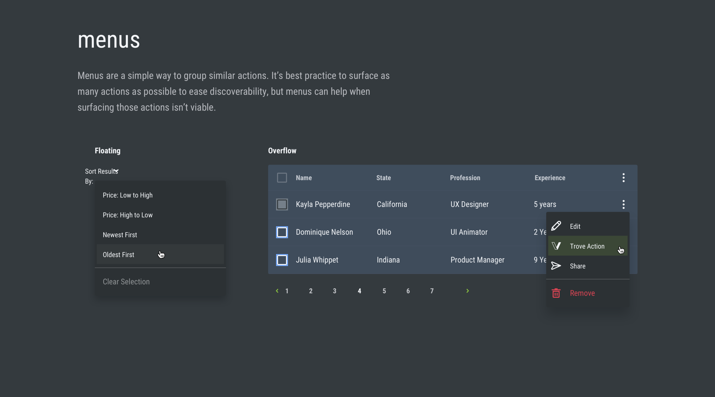
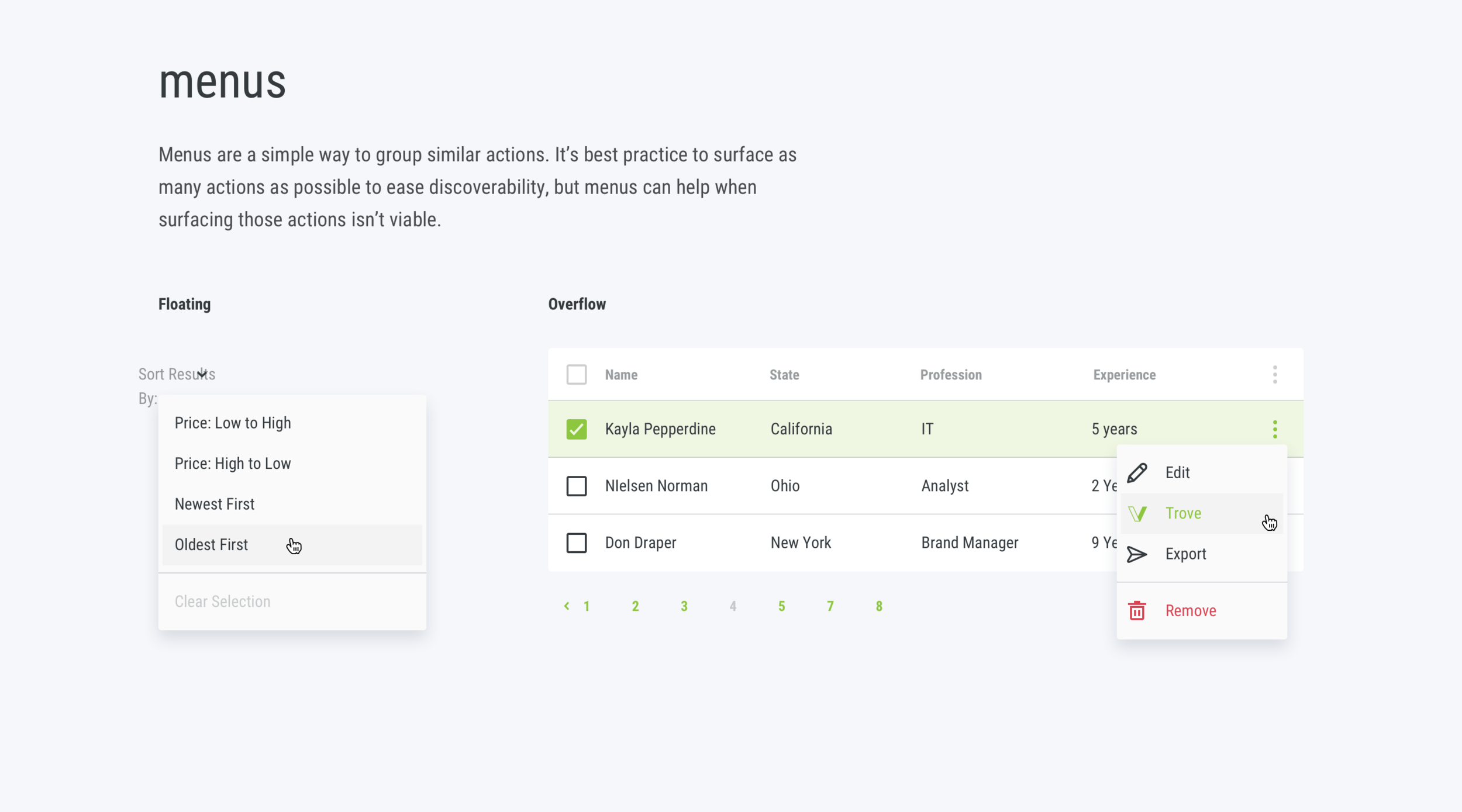
Functional Component: Dropdown
It’s best practice to use a dropdown when users have more than four homogenous options from which to pick. Various dropdown styles allow users to make selections in different ways.
Do use it when you have more than 10 options.
Don’t use it when you have lesser than 8. Use checkbox or radio button instead.

As shown on the left side, basic dropdown will allow users to select one mutually exclusive option from the listed ones
Multi-Select dropdown allow people to people to chose multiple, mutually independent choices.
Floating dropdown will have either of the mentioned functionality. It will only be used when dynamic filter is introduced for graph representation on the dashboard.
2) Dropdown without Search
Do use it when you have more than 10 options
Don’t use it when you have tons of options to choose from.

4) Dropdown so Select Multiple Options
Do use it when you have less than 10 options
Don’t use it when you have tons of options to choose from.

3) Dropdown with Search Option
Do use it when you have more than 10 options.
Don’t make your users scroll drown through tons of options ..

5) Dropdown to Select Multilevel Option
Do use it when users chose incepted option.

Functional Component: Button
Encourage users toward action using buttons. Button types in a product vary depending on the action being performed. Always use clear and concise action-oriented words and phrases.
Do align the buttons left-aligned. User it right-aligned only when grid demands it, i.e. very rarely. The contents within the container should be center aligned though.
Don’t use it center-aligned.


3) Toggle Buttons
Do use this group of buttons when you want users to change the way data points are represented on a graph. For example: do want to use data by week, month or year? This Toggle Buttons then.
Do use this group of buttons for either single or multiple selection depended on the graph.
Don’t use it anywhere else but for the data representation. This buttons should not be used to gather and record user data into the database.
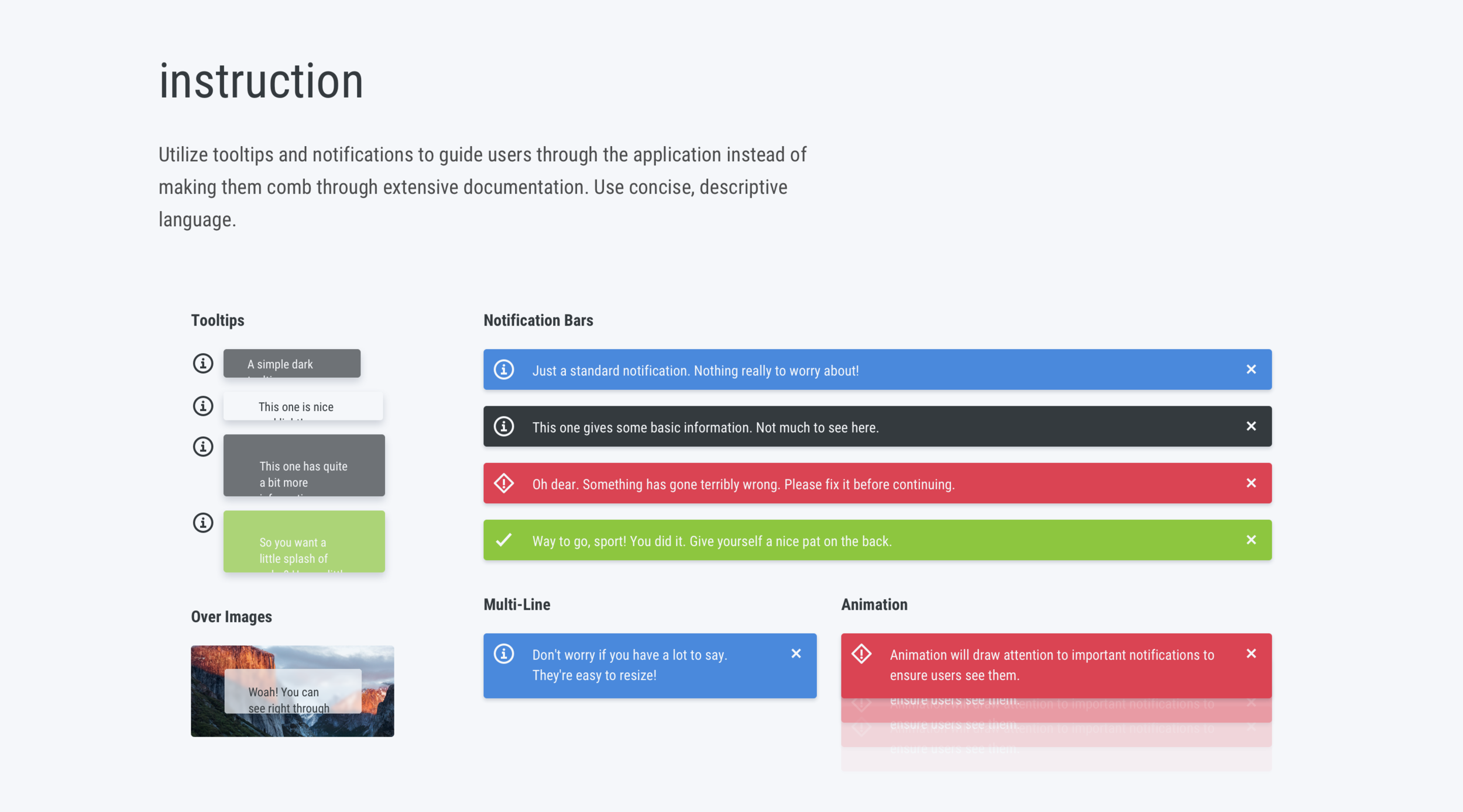
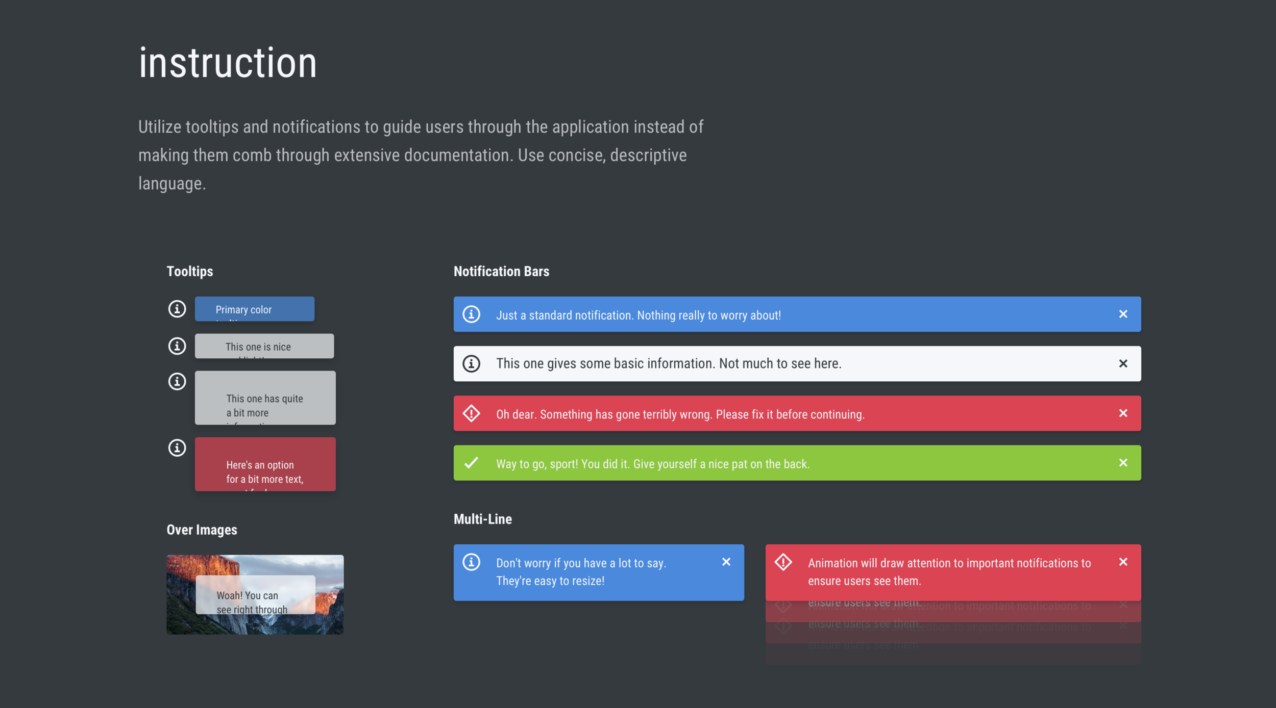
Functional Component: Tooltip
Utilize tooltips and notifications to guide users through the application instead of making them comb through extensive documentation. Use concise, descriptive language.

Design System Part 2: Branding & Visual Identity
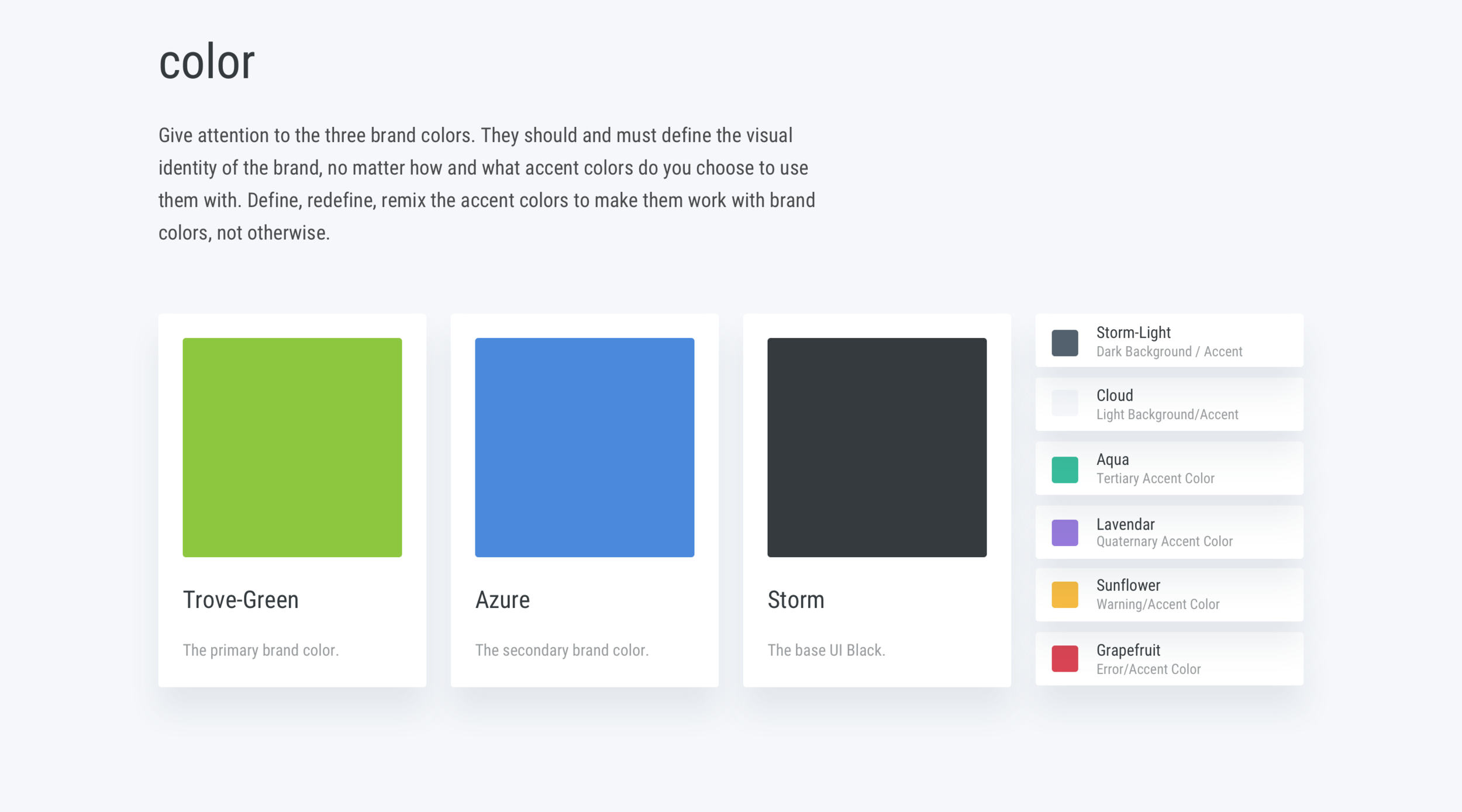
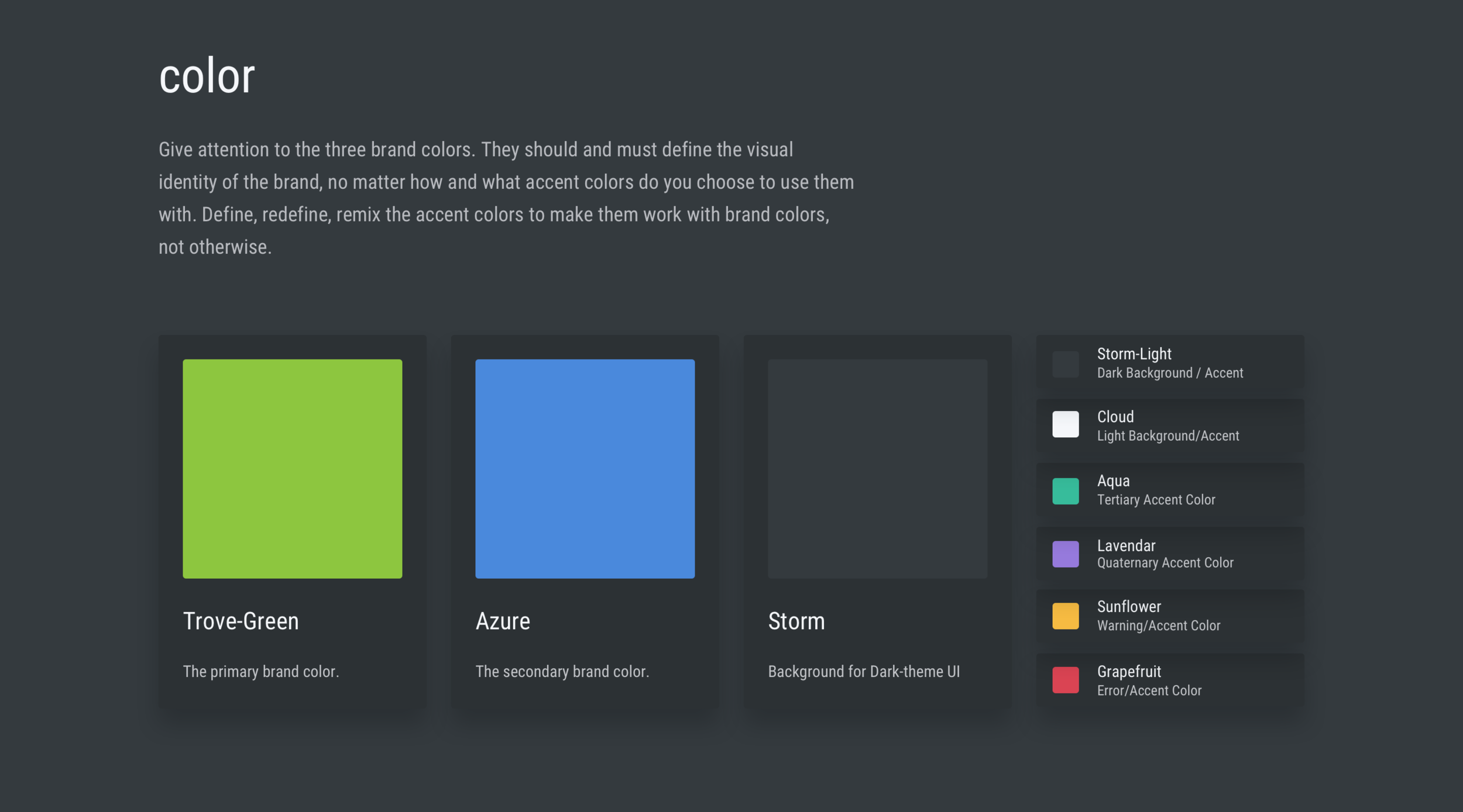
Brand Element: Color
First of all I curated two moldboards. One with dark theme and one with the light theme as I was designing the visuals for dark as well as light-themed UI. Also, without pondering over too much into accent colors, I just created the mood-boards by keeping the primary colors in my mind since regardless of the accent colors I am going to choose, the product primarily should reflect the following visual identity.
Also, had to change the hue and saturation of the original Trove- Green color to fit with the light and dark-themed backgrounds, and other primary colors.
Inspiration board for dark-themed UI:

Inspiration board for light-themed UI:

I wanted to keep the primary colors and their hue that help tech professionals to perceive the data efficiently. The purpose of the accent colors is to use sparingly along with the primary colors that help tech professionals to perceive and comprehend the data accordingly.

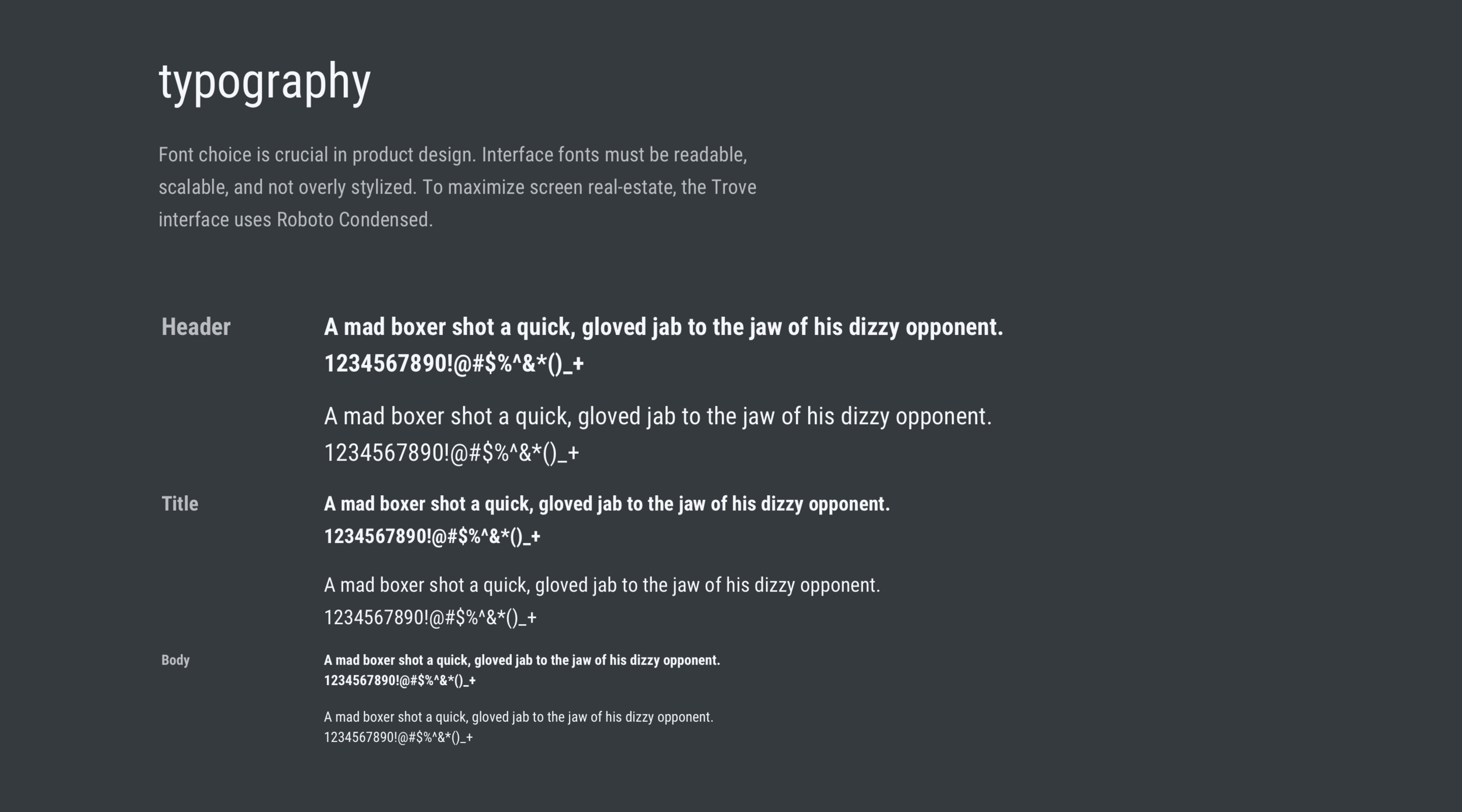
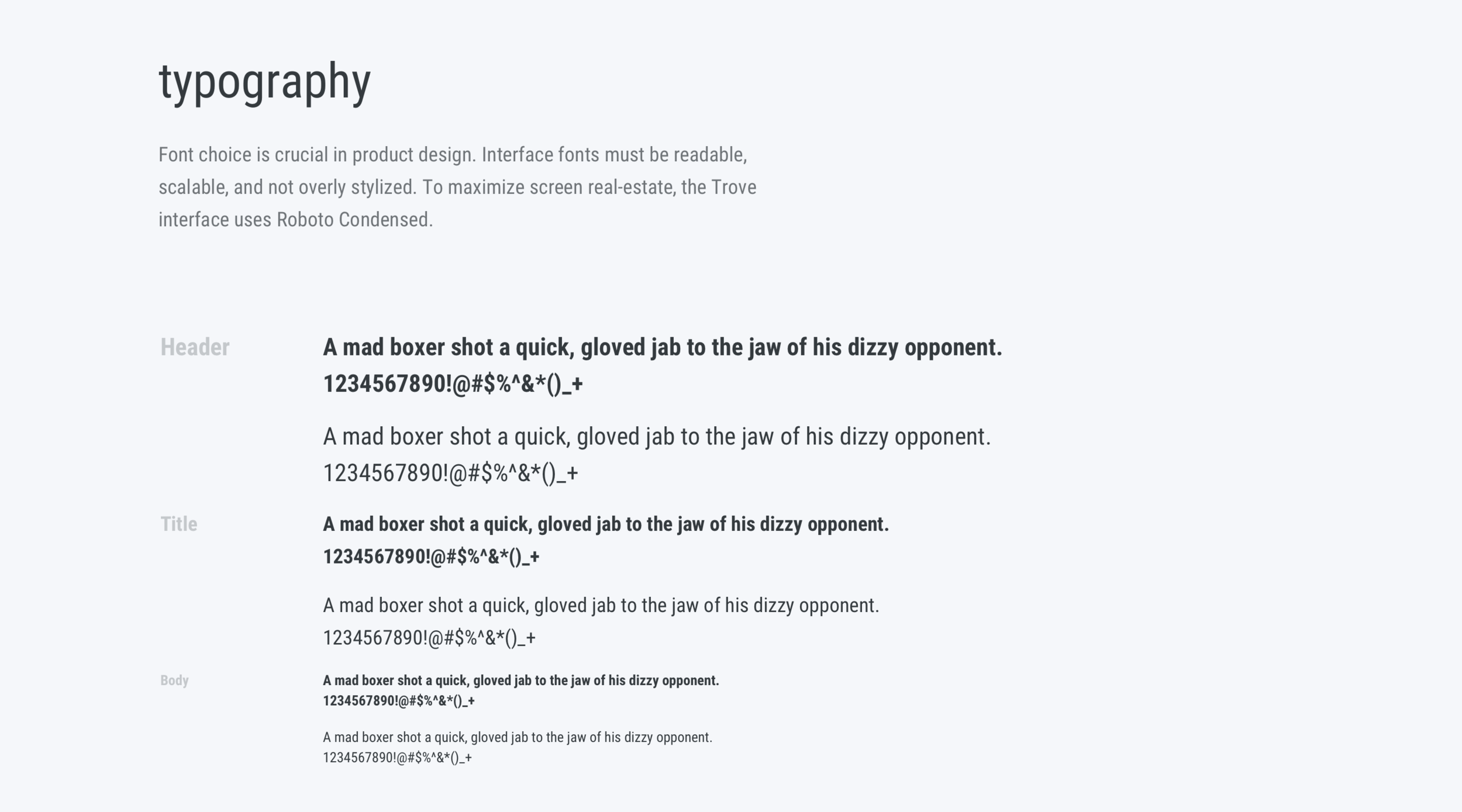
Brand Element: Type
Font choice is crucial in product design. Interface fonts must be readable, scalable, and not overly stylized. To maximize screen real-estate, the Trove interface uses Roboto Condensed.

Dark Theme UI v/s Light Theme UI
How would the brand and accent colors look like:
How would the typography would look like:
When the tooltips pop up, do they maintain contrast on light and dark theme backgrounds?
How would the brand and accent colors look like:
Conclusion
At the end of the building design system, I presented it to the upper management. They all approved it after a few discussion. During the discussion I made a headline by emphasizing two statements:
1) This is not a one-off project. It’s not “Done and Dusted.” It rather is “Done but Make it Better.” Design System should rather be treated as a product, which should be ever-evolving gradually.
2) Design System is a good starting point. Future stakeholders, of course, can go outside of it if there is a better component which serves the product idea better provided it adheres the design principle.
Success Metric
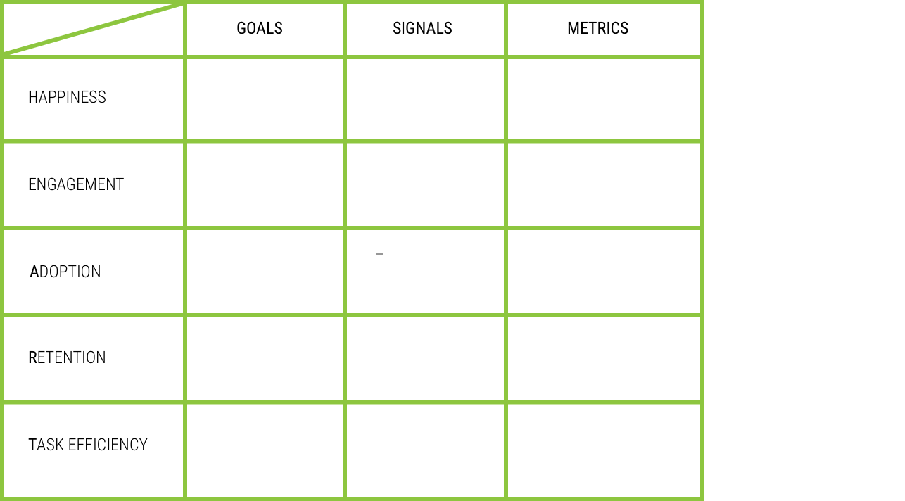
I introduced Google’s HEART framework to measure the success of the designed. Since I didn’t have the time to conduct the user testing. I created such framework for the product managers and future designers to conduct the tests.
In the following matrix, I eliminated “Adoption” and “Retention”, as every developer and designer of the company will be required to this design system. Moreover, I eliminated “Engagement” from the equation, as we want our developers to use design system quickly for a short amount of time and then focus on their development work. After all, the purpose of the design system is increase their productivity. Additionally, I added two columns into the list: 1) Users: to communicate who will be using this product or feature, 2) Method: which testing method is appropriate to measure the success

Now I can focus on designing the end product: Dashboards
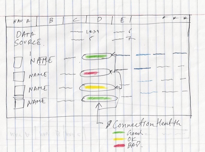
Data Source Health
Version 1: The first version of the “Data Source” health dashboard was pretty self-explanatory to the users.

Feedback: Users are not much concerned about the exact % of the health.
Indeed, they would just like to look at it and interpret that what steps to be taken according which data sources are in bad health.
Version 2: corrected version 1
Grid and blueprint of the dashboards
Version 1: 75% of the screen would be occupied by the data representation.
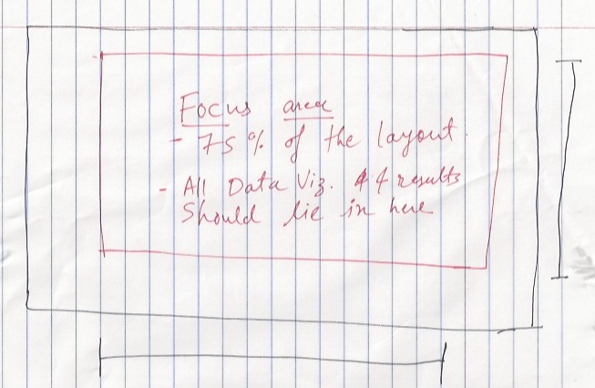
Version 2: This version of the blueprint illustrates the surrounding structure of the data representation. i.e. Primary Nav, Secondary Nav, Tertiary Nav, and Filter.

Final “Data Source” Health Dashboard:

User Testing:
Users: Data Scientists & Database Engineers
Process: They were asked to explain the dashboard.
Feedback: They expressed that now they can quickly see the status of each data source and act upon it if needed.
Data Curation
Version 1: There will be different cards of graphs on the bottom as a carousel. Users will click on each card to expand it and learn more about it.

Version 2: All the cards will be shown as a teaser on the dashboards. Users will have to click on each card to learn more about it.

My Thoughts: To achieve the minimalism, I was intending hide some information which can easily be covered by the users upon interacting with the interface.
Less Is More.
In reality of SaaS, LESS is LESS.
Dashboards are meant to help managers to perceive, analyze, and act upon the trends, KPIs, and the state of the system. They would like to read all the crucial information from the get-go.
Final “Data Curation” Dashboard

User Testing:
Users: Legal Team
Process: They were asked to explain the dashboard and give the feedback
Feedback: The dashboard serves its purpose of being an analytical and operational dashboard as the Legal Executives are able to analyze what kind of data they have in the repository and take action upon it.
Users: Upper Management
Process: They were asked to explain the dashboard and give the feedback
Feedback: The dashboard serves its purpose of being a strategic dashboard as it helps the upper management to analyze the dashboard quickly.
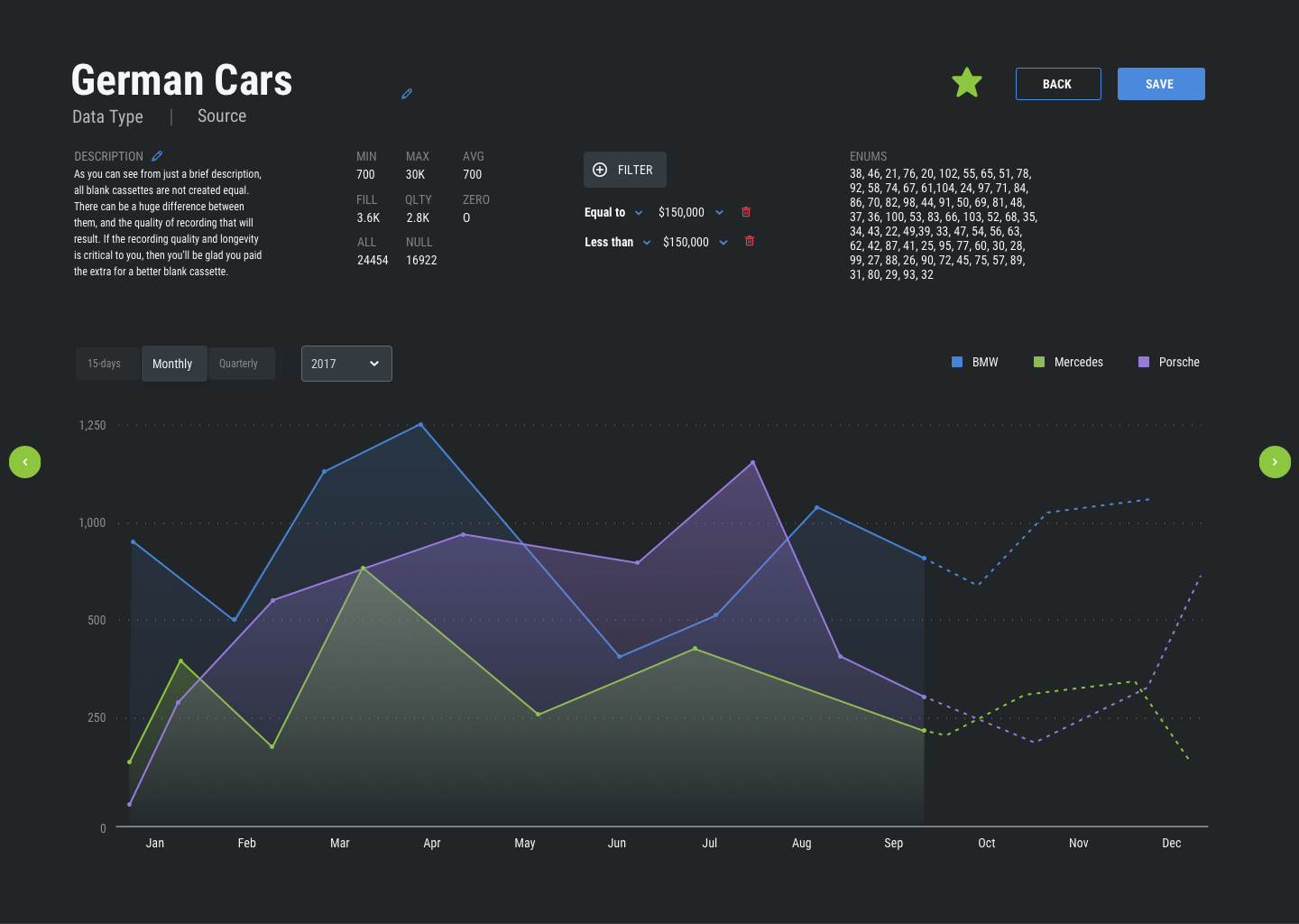
Predictive Analytics
Existing Graph: This graph is clean but through my user testing I learned users often get lost when following the data points. Along with that they can’t perceive all the data points holistically.

My Learnings: I learned that keep total number of 3 to 6 attributes to avoid the confusion. Additionally, as demonstrated below, apply drop shadow to the instances that follow the data data points.

Final “Predictive Analytics” Dashboard
User Testing:
Users: Data Scientists
Process: They were asked to explain the dashboard and give the feedback
Feedback: Now they can easily see the past, current, and future trend according to the data they have gathered. Clear distinction between past/current and future trends reduced their cognitive load whiel analyzing the data.
And, I completed my internship with a bang.
I delivered the component-level design system and SaaS Analytical and Operational Dashboards
What I Learned From My Teammates
Landing to the first role of designing B2B products I felt there are far more stakeholders involved in the development process than I expected. Reason? Reason is each product cycle should nearly 100% adhere to domain and technical constraints. Otherwise, entire system fails, business breaks! And we CANNOT afford that.
More people involved in the process would communicate all the possible constraints of the tangible and intangible system. Hence I took a lot feedbacks of my work from each stakeholder involved. For the time being, it help me craft the product better. But in a long run, it helped grow as a whole designer.
Two biggest (intangible) design skills which I learned are:
Collaboration: Beautiful craft consists of lots discussion, different perspectives, research data to back, paper sketch, whiteboard iterations
Story Telling: Bruhhhhh! why to waste others time by telling them the non--cohesive, long stories. I learned to identify my audience and then to present the information which they need the most. And through the compelling delivery, help them understand about the users’ problem and its potential solution. Leave the rest to the “QnA” session.
I truly feel blessed to be able to collaborate such stakeholders: product manager, front-end engineers, data scientists, database engineers, system administrators, upper level management, legal managers, and the content strategists.
In the Hindsight
Besides building the design system, I could also have consumed design system with the Sketch Features of Text Styles, Layer Styles, Appearance Styles, Overrides, Symbols. Then I could have delivered more work with the highest precision.
If I Started the Project Today
Then I would definitely learn front-end programing languages like react.js and d3.js and apply it to design better and faster knowing the technical constraints before hand.
I would also add the design patten library to the design system deliverables.
Conclusion
It was fulfilling and learning internship experience. I got to worked on my visual design skills along with the deep product thinking. I couldn’t ask any more supportive team. I learned so much from their guidance and critical feedbacks.
In the end, I was happy to intern at the beautiful upstate New York city - Buffalo. Here are the pictures from my travels: