
PaintZen Redesign

Working Prototype: Due to the large file size, I will only be able to show the working prototype when I present the project “in-person”
Passion Project
While I was having my work aurthorization getting renewed at University of Cambellsville from December to February 2022, I worked on two passion projects. One of them is, I redesigned a mobile responsible website for PaintZen - A Painting Service Company.
Challenge & Goal
Assume that the company has realized that many users who go down the funnel find the service to be pricey, even though PaintZen’s prices are quite competitive, and they say they’re going to do it themselves.
The goal of the project is to redesign the product that would increase the sales.
Hypothetical Context & Assumptions
For the sake of this design challenge I am going to LARP as a designer hired by PaintZen so that I can put myself in shoes of a real-world designer working for this company. Here some of my hypothetical context:
I have to assume that the users are able to navigate the UI of the “request for a quote” pretty easily, it’s just that the estimated price turns them off.
From the sales team I learned that the pricing of the product is already quite reasonable from the competitor’s point of view. So, no more reduction is possible.
It’s a price related issue. It’s my assumption that if we can reduce the price, we should entice the users with our offerings, and let them know why OUR SERVICES ARE WORTH.
Constraints
I worked with the product manager to get their feedback on the possible constraints that I came up with:
Time is limited. I have only 5 hours to come with the redesign concept and get the buy-in from the higher-ups.
I will stick with the basic tech specifications and design patterns. Something that is user-friendly as well as easy to develop by the developers.
User Testing
Upon doing quick user testing with the Customer Service team (since they represent customers to internal stakeholders), I learned and validated my assumptions. The goal of the user testing to learn that what are the main factors that may turn away the potential customers:
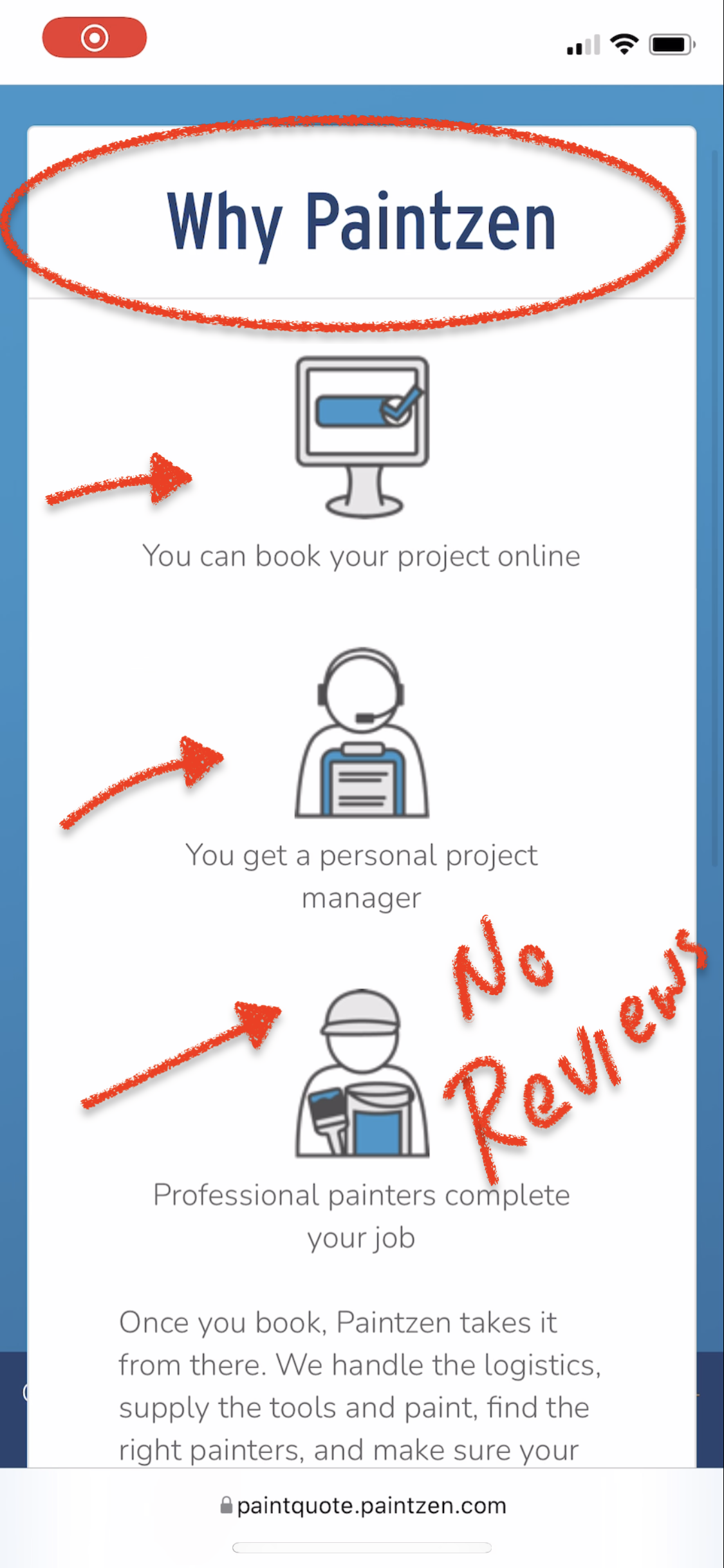
1) Price-related: Customer reviews are lacking from the “quote” page. So, there is nothing that could compel them to book the project.
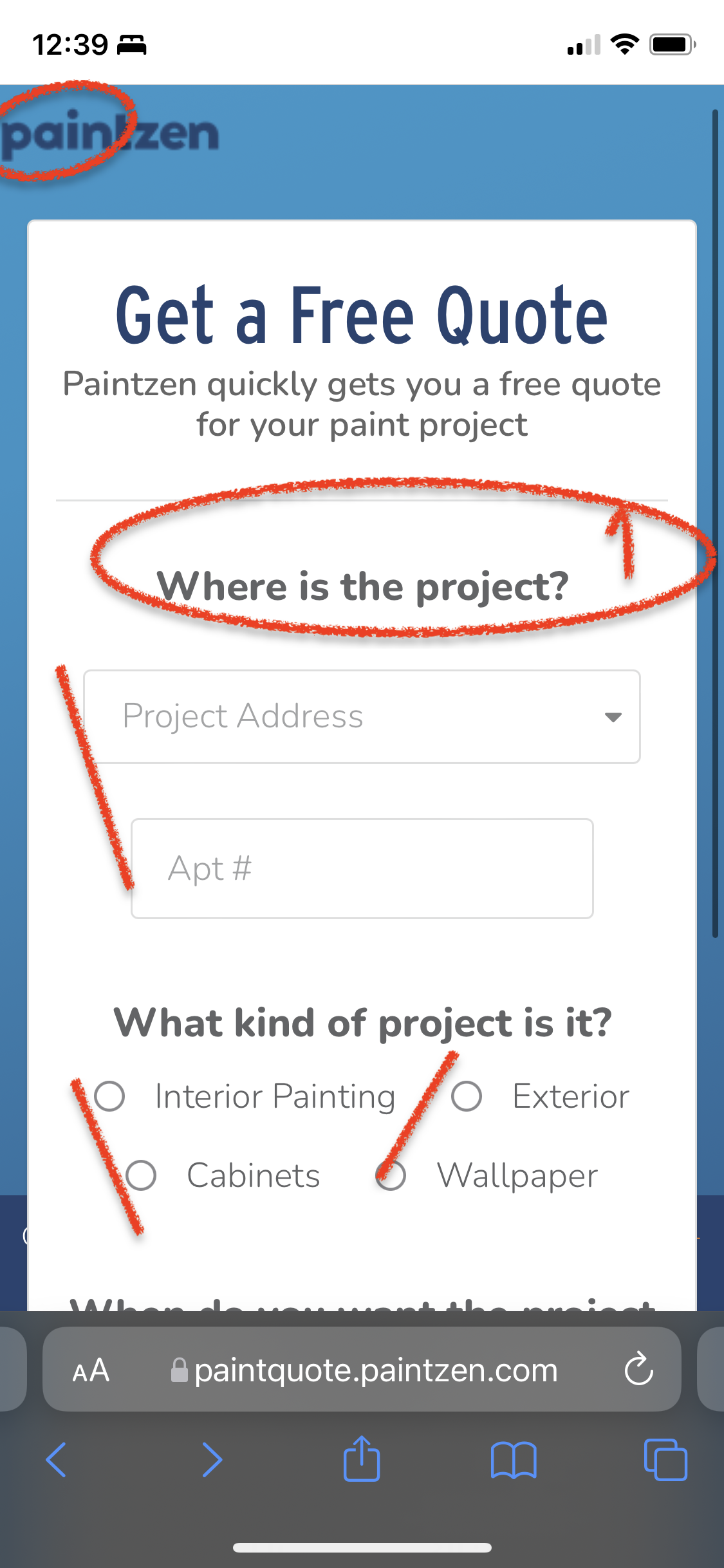
2) Price-related: The customers are not able to see the breakdown of their quoted price will they select to purchase service for multiple types of painting projects (e.g. Interior, Exterior, Living Room, Bed Room, etc)

3) Design-related: The “quote” “workflow” is laced with clunkiness, it might turn away the new customers.
Refined Product Goals
Based on the details provided above I have boiled down the challenge to three goals:
PaintZen wants to increase their sales conversion after providing quote to the users.
Entice users with overwhelming customer reviews.
Streamline the workflow.
Success Metric
The success for the business as well as the product look like as below:
Success for Business: From the sales team I learned that the success for the business would be when the sales conversation rate would jump to 350% in the summer time than the summer 2021.
Success for the Product: I worked with the Product Manager to come up with that 7 out of 10 customers will spend at least 1-2 minutes for reviewing the “Customer Reviews” section.
Design Process for this Project
While redesigning the website, I will collaborate with the Marketing team to get the customer reviews, pictures, and any promotional material that I could use.
After launching, I will actively collaborate with the Sales, CS, and Analytics teams regarding conversion rate after launching the website, and introduce new features accordingly.

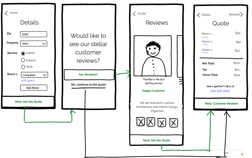
Iteration 1: Streamlining the workflow
To streamline the workflow, first of all, I wanted to add the “back” button for the customers. Regardless of the goal for the users or the business, the product must let users to navigate freely.

Iteration 2: Streamlining the Workflow
Also according to the feedback I got, I wanted to see if I can help the customers with a wizard of any kind since it’s a multi-step flow. Since, I am designing for Mobile screens, I wanted to try out different options and see which one fits functionally the best in small screens.
Version 1:

Version 2:
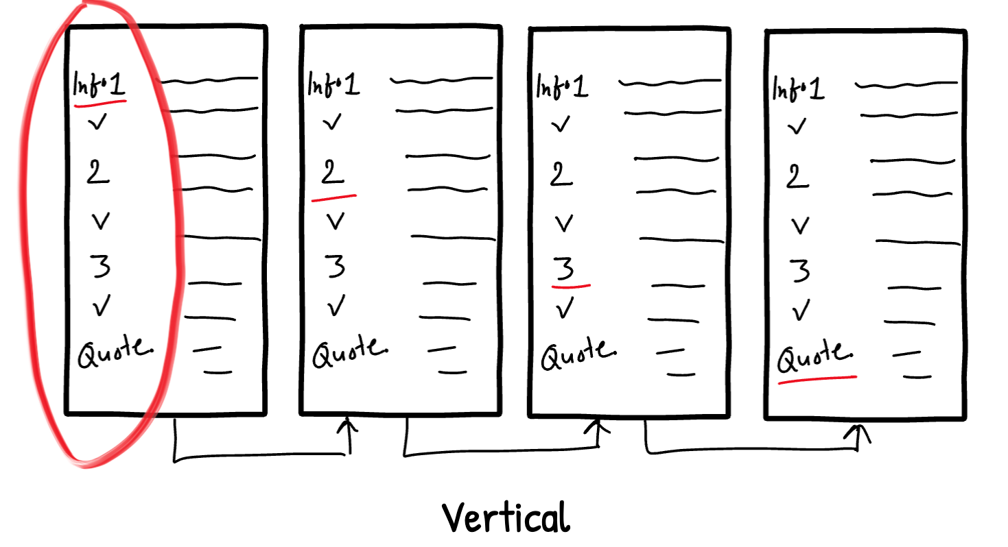
Version 3:

My Decision: I would have liked to test these design patterns with the users to get their feedback. But, since it was not our primary goal, I decided to go with the safe and easy design pattern. I would go with a simple option of “back” and “ next” from their current location in the website.
Also, the I wanted to stick with the designs that would not need JavaScript development to make it easy for the developers.

Iteration 3: Customer Reviews While Getting the Quote.
I am collaborating with the Marketing and CS teams to gather the top notch customer reviews that will encourage the customers to see the value for their money, and eventually book the project. I came up with a couple of variations for how go to about displaying the customer reviews to the customers in the best way possible.
Version 1: In this version, the customers will fill out the personal as well as project details as usual, and then they would go to the “Reviews” page. After looking at the stellar reviews that I got from the Marketing team, they will go to checkout.
Pros: Here, the reviews might have a positive impact on customers that might encourage them to book the project. Cons: Customers that are only interested gathering quote, may find it cumbersome.

Version 2: In this version, the users will first get the quote, and then they will be asked to check out the reviews.
Pros: Having customers look at the reviews after getting the quote. I tried to balance user freedom with marketing the company’s achievements. Cons: Price before looking at the reviews might turn some customers off if they don’t already know if the price is worth. They might not even look at the reviews after learning the quote. (RED FLAG!!!)
Version 3: In this version, The users will get to see the reviews BEFORE the quote only if they want to.
Pros: A heads up given to the customers if they want to look at the stellar reviews before getting the quote. Asking for their permission!! Cons: The user might still choose not to look at the reviews. (Again, Red Flag)
User Testing
Since instilling the “Customer Reviews” in the “Get a Quote” workflow is the imperative Product Goal of this project, I decided to conduct a quick A/B testing with two potential-customers. And, I validated my assumptions as well as got the feedback from the users regarding my redesigned app:
As illustrated in the version 2, to reduce the decision overload, it’s better not to ask for their permission, and rather just show a quick “Customer Review” page. It’s anyway going to help the customer for making an informed decision.
In the reviews section, besides the testimonials, they would like to see quantifiable data illustrating how great of a company service is!
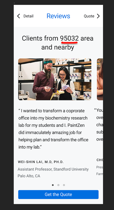
It would be better to give personalized customer testimonials. Rather give the testimonials from the past customers that hail from the same area as the potential-customer.
Mobile Technology
I was wondering if I should design a native app or a mobile responsive website. But, since we have budget constraints, it’s better to stick with mobile responsive website. IT requires considerable amount of time and money to launch and market a native app - especially for iOS.
Final Hi-Fi Designs
I have come up with three final recommendations that would accommodate “Customer Reviews” a bit different from each other
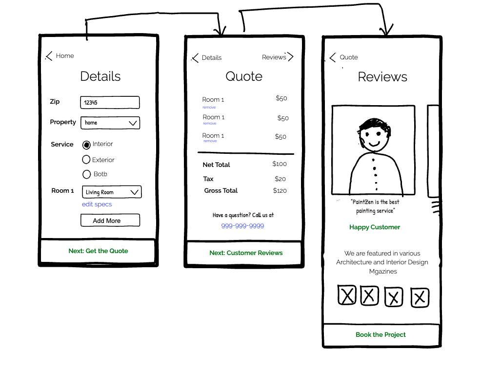
Recommendation 1: Classical style. After filling out the details, Show them a quick review page and then show them the quote.

Recommendation 2.0: Embedded Customer Reviews along with the Quote. Customers will first land to the “Price” section and then “Customer Reviews” section.

Recommendation 2.1: Embedded Customer Reviews along with the Quote. Customers will first land to the “Customer Reviews” section and then “Price” section.

My Decision: I would like to in-depth A/B testing with the real customers and decide which design I should go for. Although, as of now, I can confidently say that I would prefer to go with the Version 1 workflow. It’s the simplest of all for the engineers to develop since there is no embedded section unlike the version 2.0 and 2.1.
User Feedback Incorporated - Quantitative Data added in the “Reviews”: One of the valuable feedbacks I got from the A/B testing that I should add quantitive data that describes the superiority of the company along with the qualitative testimonials from the past customers.

User Feedback Incorporated - Added testimonials from the clients that resides in the same area to give a personal touch. In the “Details” sections, if the customer has provided the Zip code “95032” then the testimonials of those customers will show up that also reside in the surrounding areas.
New Feature - “Remove”: Price Breakdown for individual rooms that need to be painted is shown. Also, I added a “Remove” function, if the customers realizes realize that they can only afford to book the project for the some number of rooms but not all. This feature provides clarity and freedom for the users.

Revisiting the Product Goals
With the help of the Marketing and Customer Success teams, I believe that I am on the right course of achieving the product as well as business goals. The customer reviews shown in a compelling fashion help my users to gauge if the price is worth the quality, and eventually book the project with PaintZen.
Also, I streamlined the new workflow and the designs are more delightful and intuitive to interact with.


Where I Went Wrong
One of the secondary goals of the project was to present the simplest solution with easy tech efforts are required. With my proposal of website being able to show the personalized testimonials is not the simplest solution. Although I could be wrong, but I assume that it would require a good amount engineering that would pull up the select testimonials from the pool of hundreds or thousands to match with the customers’ residence zip code.
Next Steps
As a next step, I would like to A/B test these final versions once again to check the usability of my designs and launch it as soon as possible. After launching it, I would work closely with with the Sales teams to learn the increased sales of the services, as well as with the product manager to see if the metrics meet the benchmark.