

Overview
This is design challenge turned personal project given by a consumer-based company in San Francisco. I have designed an application which allows people to pre-plan their visit to the zoo, augment their enjoyment while watching the animals, and share their personal experience with other people.
I am passionate about designing Products. The biggest testimony to this claim is that I tackled this challenge while being on a vacation with my family in Los Gatos, CA.
Vacation v/s Design Challenge
(read: Inspiration!)
Before we go further, I would like to mention once again that I am tackling this challenge while spending vacation with the family. But family outings helped me stem creative ideas. I learned how to take inspiration from the surroundings.

My Role

I designed this product as a Product Designer. Following were the main concerns I had while discovering and understanding the UX challenges, and discovering and finalizing the designs.
A complete UX Design
Minimum Viable Product
Growth Design: New user acquisition, retention, and engagement
Let’s Understand the Problem, First.
When I was a kid, my parents always took me to zoos, aquariums, sanctuaries to have a broad understanding of wildlife animals thriving in the air, on the land, in the water. Haven't we often found ourselves struggling in planning the zoo trip efficiently? Haven’t we always desired a drama-free outing and picnic with our family?
Hence, I felt empathic towards a 10-year-old me and many children who are presently at same to design a digital system that helps them and their parents plan out the zoo trip in delightful fashion.

source: shorturl.at/nsKR1
User Research Insights
Attitude towards zoo
In general, people enjoy visiting zoo. It's refreshing, informative, and a picnic with kids.
While being at the zoo
People would like to reach early to buy the tickets, watch the animals playing, eating, etc.
Before going to the zoo
People would like to learn about the attraction of the zoo from the news & advertisements.
After completing the trip
They are tired, and share their experience with friends to inform or warn them.
Now What? Solution? Here It Is.
Optimize your time by planning which animals to watch at the zoo. (Get to learn their location, nap time, unavailability, etc.)

Buy the tickets now and don't worry about standing in a queue while entering the zoo

Learn from others experience, and help others by sharing yours

Wondering how I reached to this solution?
Sit tight, let me take you to the journey of eureka!
Internal Communication
Let me ask you one question. How many times we do not land to the right solution because we have not understood the problem in the first place?
Ruminating over the problems helps me have a clarity in my mind.
Some of a zillion thoughts:
Why do people go to Zoos? Maybe for entertainment? Maybe for information? Or Infotainment?
If the people are wildlife and nature enthusiasts then why wouldn't they go to animal or bird sanctuary? Why wouldn't they go for Snorkeling or Scuba Diving to watch Oceanic Ecosystem?
Personally I would like to watch the birds and animals in wild.
BUT! This is not about me. This is about my users. Why wouldn't they prefer Sanctuary over Zoo?
There are people who don’t have time to go in sanctuary. Usually they are far away from regular cities and towns. They might feel “unsafe” going in wild. Or simply they cannot physically or financially afford going to visit the sanctuary.
Hence zoo seems to be an easy and affordable option. Additionally zoos allow people to enjoy the animals and birds across other countries, continents, and the globe.
Meanwhile, I had some questions and queries regarding the UX journey of the users. The best way to answer them is to talk to the users who face the problems.
General
Assumptions
I have created a fake context to give you an idea of my mindset while tackling the design challenge.
1) The zoo is situated in Fremont and is the biggest one in North America.
2) The zoo has asked 10 freelance product designers to design a mobile application of the zoo which can make people visit the zoos more often.
3) Only 1 designer would be given the contract whose proposed solution is functional, usable, delightful, and valuable. On the another hand , the design should be Technically Feasible and Financially Viable.
When in Doubt, Talk to the Users!
To solve a problems, it is very important to speak with the people who are facing the. I gathered 4 people from a simple Facebook post. I interviewed them via telephone.
I wanted to ask people about their experience of museums as well. Because I believe the mindset of visiting zoo and museum is very similar: watching and learning new things. (read: animals or art.)

Getting Up, Close, and Personal
This problem discovery phase helped me to define my target users, their stories, . Based on the interviews, I defined the three type of personas:
Primary users will be using the product regularly.
Secondary users will be using the product sometimes.
And also, there are some people who are not my users at all.

Disclaimer: For this design challenge, I would only discover POVs, User Journey, and design the solutions for the primary users.

After learning about the users, I decided to use "Point Of View" framework. The POVs helped me set the priority, high-level problems of each of the primary users.

POV 1: Niyara would love to take his son to the places like zoo because learning about new animals and birds helps kids' cognitive and emotional growth. At the same time, she is a working woman so she would like to manage the family and work time efficiently.
POV 2: Adam would love to learn about new animals and birds because, it's the only way he keep himself "breathing." He would love to go to jungles, sanctuaries, and zoos to learn about them. At zoo, he can read, discuss about wildlife with the fellow tourists.
After defining their Point of Views, now is the time I would deep dive to into their journeys.
Users’ Current Journey & Pain-points
I divided the user journey of my primary users in three sections: 1) Learning & planning a trip to a zoo 2) While roaming in a zoo 3) After finishing the trip.

Phase 1: Before visiting the zoo
1) It is hard to precisely find and learn about the animals in advance. Often times, they have to rely on second or third-hand experiences.


Phase 2: While being at the zoos
1) Due to a long queue the users feel their time and energy are wasting.

2) Nature lovers and curious visitors love to read information of their favorite animals. But sometimes they can not read the whole information as they have to make a way for crowd.

3) Disappointing to see their favorite animal inactive: Users likely to be very disappointed if they see their favorite animal is taking a nap but not playing or do some activity.


Phase 3: After visiting the zoo
1) If users have not optimized their time for each exhibits they would eventually feel lack of energy and time. And, this emotional state-of-mind might affect their opinion about the zoo while sharing with the friends and family.

I scoped down the issues I am focusing on.
Now let’s explore solutions. And, yeah keep the belt fastened.
Getting Basics Done!
Market Capture:
Q: Is UX or (early) Market Presence the most important aspect of any product?
A: I would say that Sustainability is the most important aspect of any product.
I am eyeing to launch the product as soon as I design a Minimum Viable Product. If I keep on waiting to develop a perfect product with great functionalities then I am losing the competition and edge of innovation.

In the given time, few features that help users achieve their main tasks efficiently would earn me goodwill in the market as opposed to a lot of features designed lousy.

Brainstorming Ideas through Sketches
From my past experience I have learned that the best way to stem creativity is to produce tons of ideas on paper. I do neither delve on details nor sweat for quality while sketching out my ideas. My whole purpose to get the ideas out of my mind.

A Few Ideas I Generated 💡
1) Virtual / Augmented / Mixed Reality System :

source: shorturl.at/hPU12
This system can help my users to visualize the surrounding of the zoo anywhere, anytime
Pros: Mesmerization, Vivid visualization, Highly-interactive way to plan the zoo trip .
Cons: Time, Effort, and Cost
Verdict: I would like to have a conversation with my product manager and developers to learn how much time it may take design a cost-effective VR solution. So for long-term, this could be an good solution, but for now it would be an ambitious project for zoos.
2) Voice Assistant:

source: shorturl.at/hiHJQ
It lets users to book the tickets with their voice command.
Pros: Hassle free, Time-saving, Multitask
Cons: Frustrating if the the system does not understand my users’ accent and pronunciation. Hence, it could be cumbersome for the users to use.
Verdict: This system is not visually interactive. Remember, my secondary users who are kids. They might not find this system engaging as there is nothing to see that invokes the emotions among them. Visual Language trumps Spoken Language.
3) Chatbots:

source: shorturl.at/syMOU
It would let users to plan their zoo trip by communicating with a conversational chatbots. Pros: Cost-effective according IBM Watson, Quick on-demand service, Can reply in form of text, pictures, videos, Lead on
Cons: Null decision making, Time-consuming
Verdict: For my secondary users, again, there is no visual interactivity. However this service can co-exist with the main system for adults to use for quick tasks getting done. For now, let me first focus on designing the main system and then chatbots.
4) Desktop Website:

It would let users plan their trip on the desktop computers.
Pros: Big Interface and High Interactivity
Cons: Not much though desktops and laptops are not instantly accessible
Verdict: I could consider this option if I don’t find any other option which is more feasible and convenient.
4) Mobile Application:

source: shorturl.at/eiPQT
It would let users plan their trip on the mobile phones.
Pros: Instantly available, Thumb-Device Interaction, Engaging Interactivity
Cons: Smaller Interface
Verdict: This option is also enticing as it balances between user engagement, ease, and instantaneousness.
Final Verdict
(desktop vs app)
It is easier to design core-functions for the smalls screens and then branching out to many supplemental functions than otherwise. So I would choose a mobile-first approach while designing this applicaiton.
Moreover, according to a blog published in UXPin, that mobile-first approach is always good idea from inclusivity perspective. And, I quote:
“ The opposite approach ( of Mobile-first) is graceful degradation. This incorporates all of the complexities right from the start, then strips them away later for smaller devices. The problem with graceful degradation is that when you build the all-inclusive design right from the start, the core and supplementary elements merge and become harder to distinguish and separate. The entire philosophy runs the risk of treating mobile design as more of an afterthought since you’re “cutting down” the experience.”
Technological Assumptions
1) All the users of this app are iPhone 6, 6s, 7 , or 8 users. Hence I would design an iOS application with the aspect ration of 375 x 667pixels.
2) Zoo has an internal map which guides visitors throughout their journey inside the zoo.
3) The database of the users who visited the zoo and their app are connected. So the feature of sharing the zoo-experience is only for those users who recently visited the zoo. The zoo authorities will be able to scan the e-tickets of the users.
Core Feature
These core features are carved from the research insights to solve existing pain points of the users.
.- Buy tickets: Users can buy entry tickets with the help of mobile application.
- Save Exhibits : Users can learn about animals well in advance and save the exhibits that they want to visit.
- Reviews: Users can freely share their experience, and audio/video media they have captured. So it will help others to learn from their visit.
Key-Extra Feature
- Augmented Reality: While reading the information about the animals the users can learn about them with the help of Augmented Reality Videos as well. That would be fun and engaging.
This feature is be enlisted under Extra Feature. As it might take more time and resources to implement AR technology across the Zoo.
Architecting before Crafting
After creating a lot of ideas for interaction, I laid out information architecture for optimal interactions. This architecture has helped me keep the interaction designs consistent according to the problems I am solving.

Solution for User Journey 1
(before visiting the zoo)
Pain Point 1: It is hard to precisely find about the animals at the zoo. It is inconvenient to completely rely on second or third hand experiences.
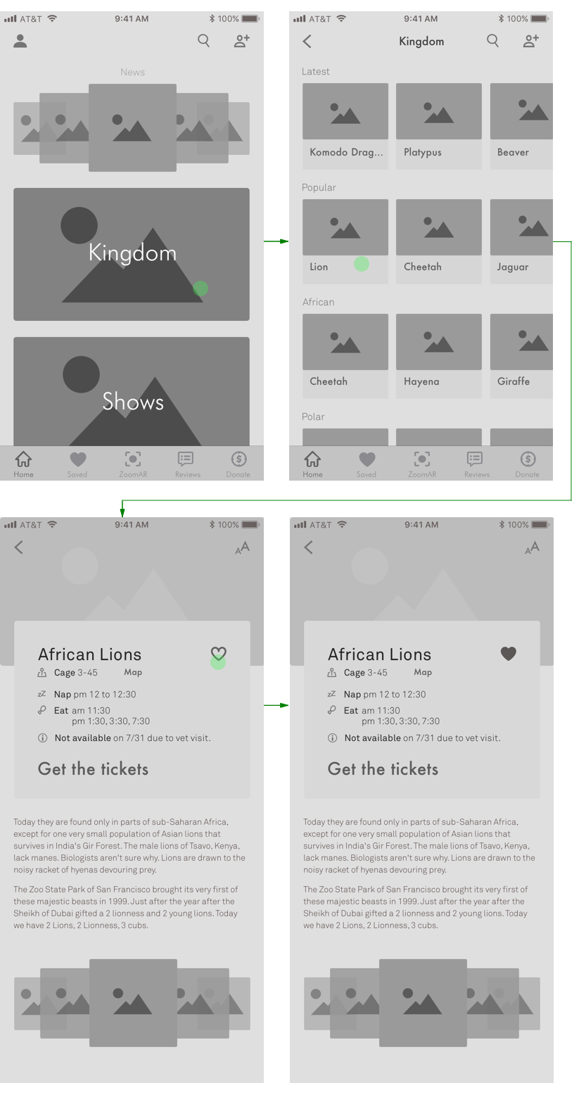
Solution 1: The application would help users to learn about the animals according to its categories: New, Popular, African, Tropical, etc. They can also learn about each animal one after another.
Pain Point 2: It's disappointing to see their favorite animals sleeping/inactive.
Solution 2: Users can learn their nap time and unavailability of their favorite animals. So they can avoid going to the zoo during that time.
Pain Point 3: They have limited resources to rely on to learn about the zoo beforehand.
Solution 3: Now they can read the reviews with just one click.

Solution for User Journey 2
(while visiting the zoo)
Pain Point : Users might have to wait in a long queue to buy the tickets.
Solution: The users can now buy the ticket with the help of application, they would just need to scan it while entering to the zoo.

Edge Case: While buying the tickets, if any user tries to buy a toddler's ticket without buying at least an adult's ticket. Then the system would not let him buy one. Because the ticket of toddler must be accompanied by an adult's ticket.

Solution for User Journey 3
(after visiting the zoo)
Pain Point 1: In retrospective, users wish had they learned enough information before visiting the zoo. Therefore they empathize the future visitors as they might face the same problem.
Solution 1: Now users can easily share their experience. User can rate their experience either by "thumbs up" or "thumbs down." They can also elaborate their experience in the comment section to forewarn the future visitors. Furthermore, they can also upload the media like AR video, photos, and videos captured from their devices.

Key-Extra Feature
(solves pain point of users while they’re at the zoo)
Pain Point: Can't read the whole information of all the animals users like because they would have to make a way for the crowd.
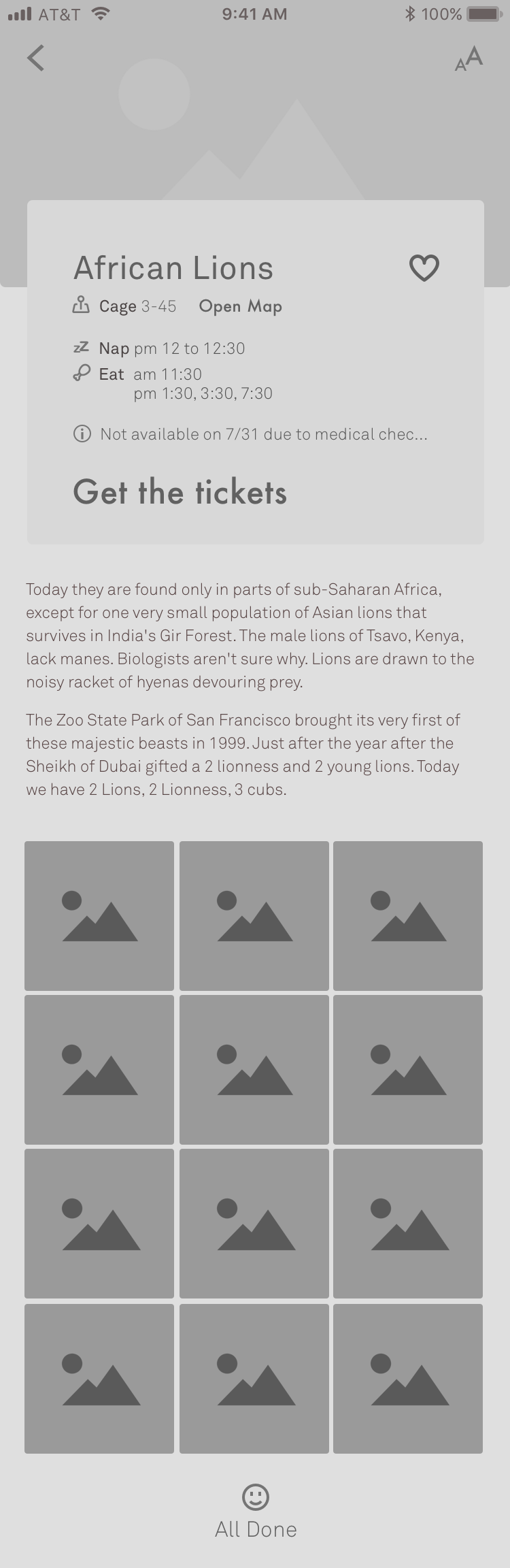
Solution: Now with the "ZoomAR" feature users can point at the information board at the exhibit and the Augmented Reality feature will start running videos about the animals. Now the users can learn in a more engaging and delightful fashion.
They can also save these videos on the app's cloud and they can use these saved videos share with the other users while sharing the experience. [see Interaction for U. journey 3]

Before reaching to this workflow,
I have considered several options for the interfaces that my users will interact with
Subtle Branding
Version 1
My first version of the wireframes include the branding bar on the top just like many iOS Apps. But I quickly reviewed the Human-Interface Guidelines of iOS and decided to remove that.

Version 2
"Great apps express unique brand identity through smart font, color, and image decisions." -HIG, iOS. I decided to keep my brand subtle. Hence the UI does also look clean as I can take advantage of more whitespace.

Gallery: Grid vs Slider
Type A
While designing the gallery for the African lions first I came up with the UI Pattern: Slider. The users would simply have to slide the from one direction to another.

Type B
On a second thought, I came up with the grid structure of the gallery. The Grid structure is also known as a standard one in the industry. This comes up with infinite scrolling.
My Verdict:
I would use the UI Pattern - Type A: Horizontal Slider. The is mainly because the fact that Grid Structure comes with "Infinite Scrolling." Infinite Scrolling keeps users clueless that if they are supposed to wait for scrolling further, or they have reached to the end of the gallery.
Although users are accustomed to Grid Structure for Gallery, they will get used to Slider for viewing the gallery pretty soon.
Bottom bar: just Icons v/s with Text
Type A:
This version of the bottom bar just includes identifiable icons.

Type B:
This version of the bottom bar includes icons along with text below each of them.

My Verdict (read: hypothesis, user testing needed) :
Even though Type A bottom bar is clean, minimal, I would go for Type B. Reason being, many of my target users could be non-tech savvy and might not be able to interpret the icons. Hence for the sake of inclusiveness I would use Type B bottom bar.
Visual Mood
1) Since this is a Zoo related App. I wanted to use a primary color which is prevalent in natures and zoos: Green (#007f00)
2) Moreover I wanted to use clear pictures of animals which gives a feel of a zoo or a jungle.
3) I have used shades of Dark Gray (#767676 and #2626262) and Light Gray (#fdfdfd and #ffffff).
4) I have used several fonts of of two typefaces: Futura and Akkurat. They complement well with each other and are sans-serif type. Hence, I make design a minimal UI.
Pixel-Perfect UI
I have done some minor changes in the proposed wireframes while skinning the product to make it look clean and minimal. Those are related with whitespace, layout, fonts (size, and weight), etc. Although 95% of the proposed wireframes and 98% of interactions are still retained while designing high fidelity prototypes.

Conclusion
I believe that I am able to solve users' problems by designing thoughtful Interactions and engaging Visuals. If I would like to do something more than what I have done then I would have loved to illustrate an interactive zoo-map. It would be informative and 10x more engaging.
Next Steps
My next steps would be to test my designs with the users and iterate the interaction and visuals which facilitate their needs.
I would love to learn and use AfterEffects to animate the seamless interactions. I believe motion design is one of the important aspects of facilitating the feedback and perception of the current state of the system.
What I Learned
I learned how to tackle a design challenge and a vacation together. Juggling work and Personal daily life is hard for sure. But juggling Work with Vacation is even harder. I learned to manage that. And I am able to finish the challenge satisfactorily in 7 days.
To be honest, I would not let go once-a-year vacation with the family. At the same time I would not let go an opportunity to work at one of my favorite workplaces, Yelp!!